The Taith
Wordmark, Logo Design, 2023
Wordmark, Logo Design, 2023
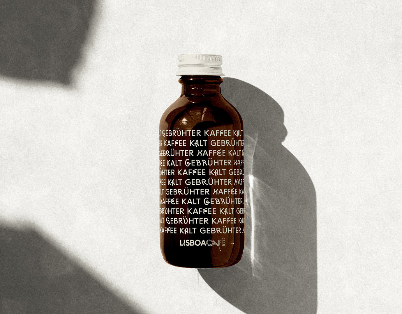
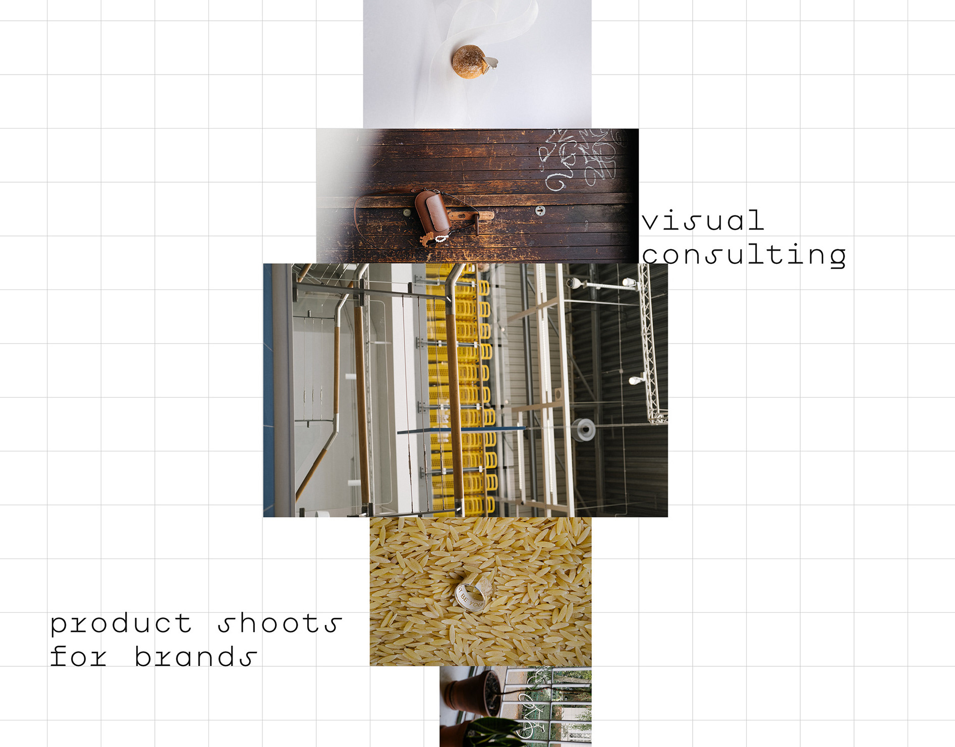
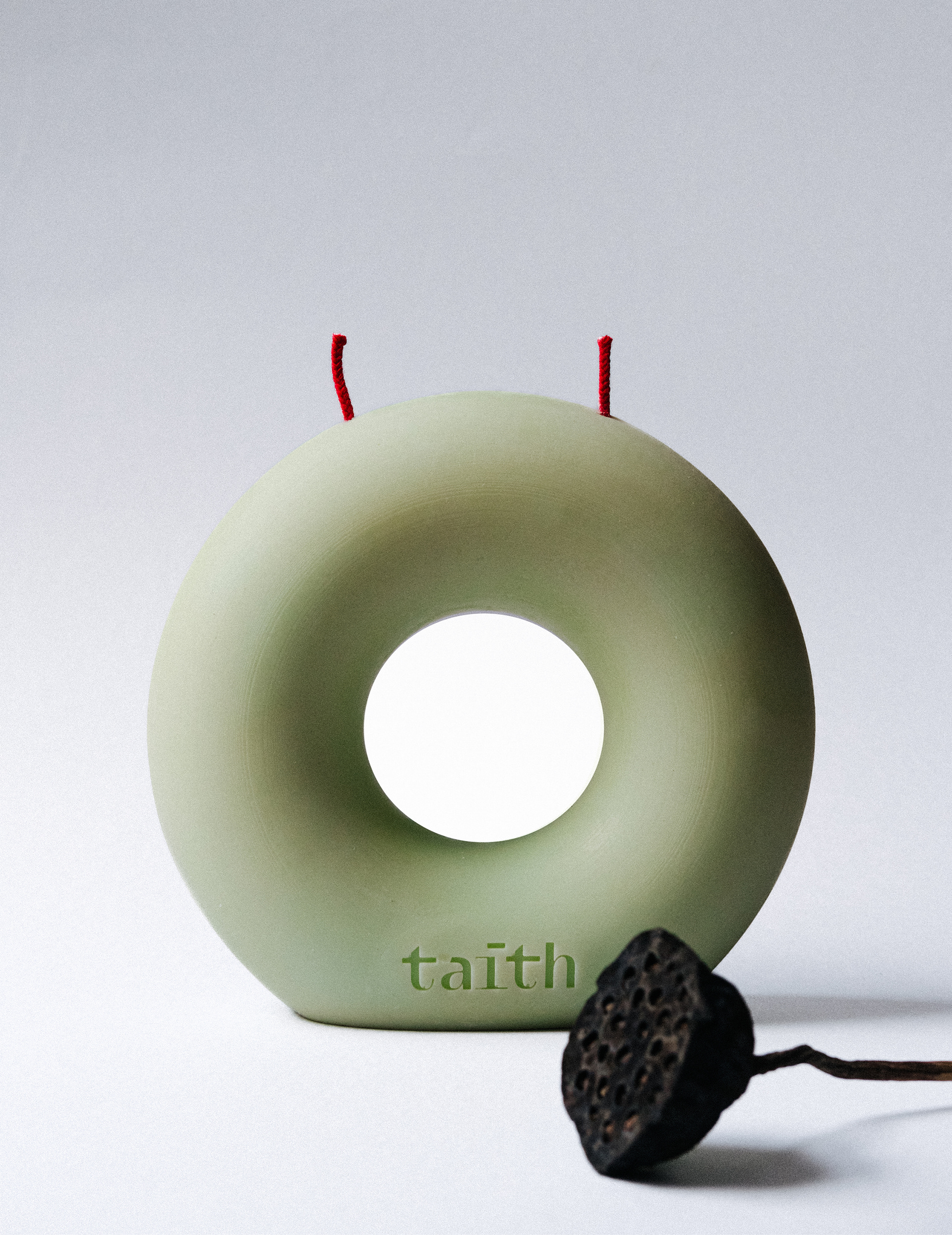
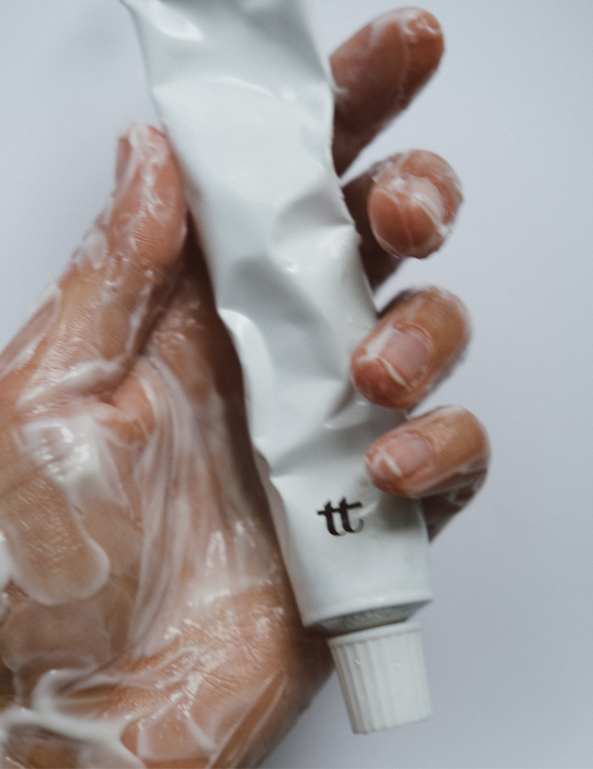
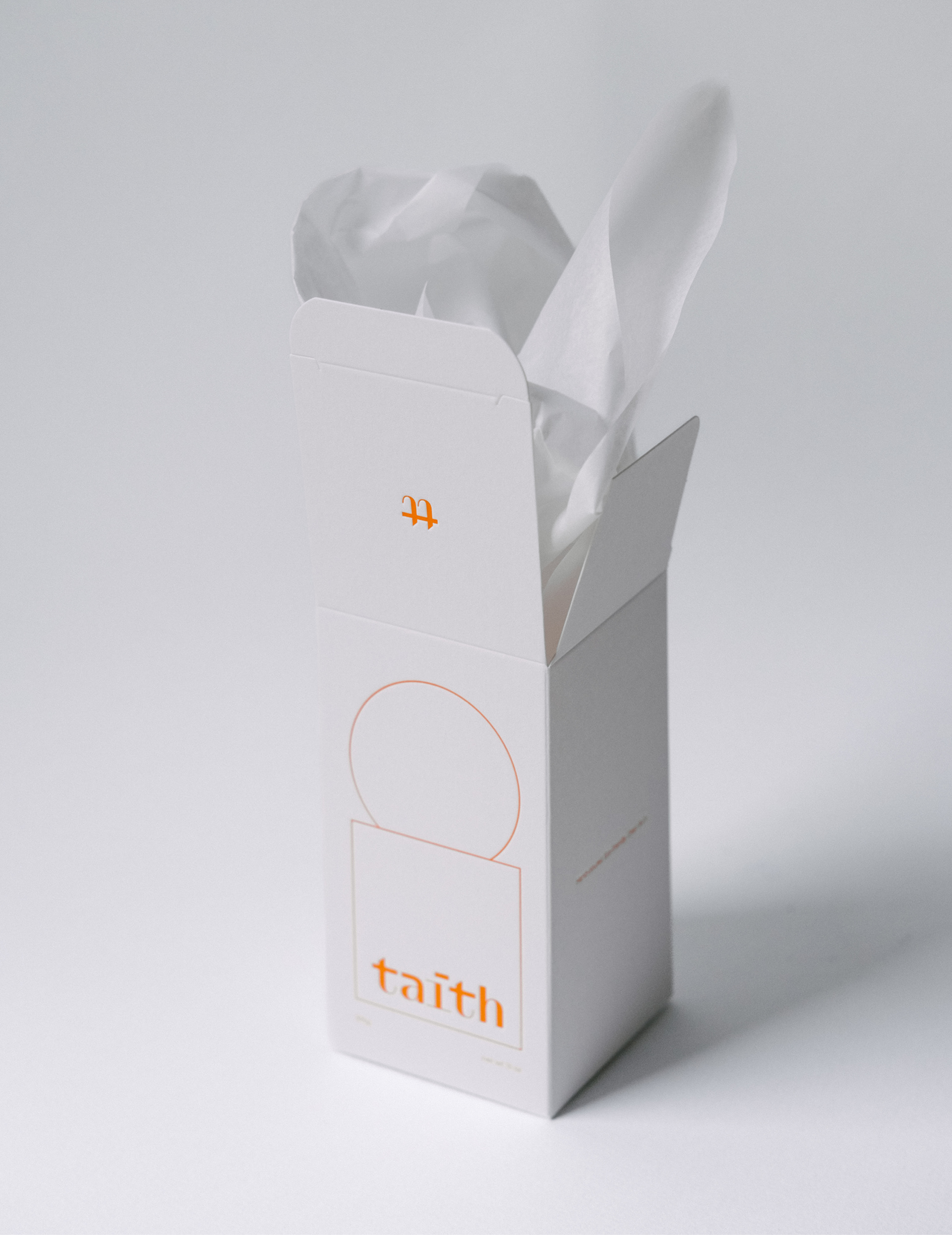
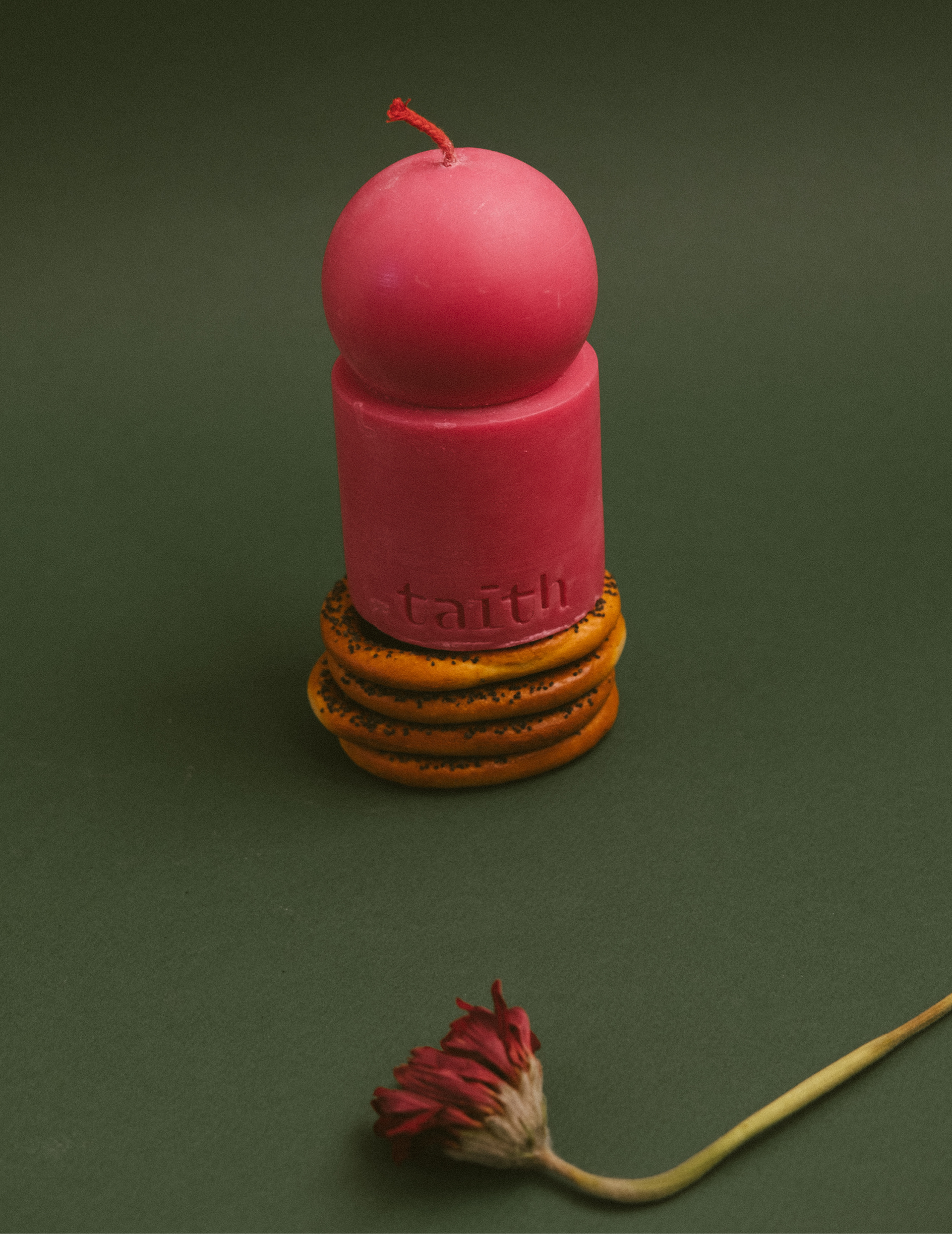
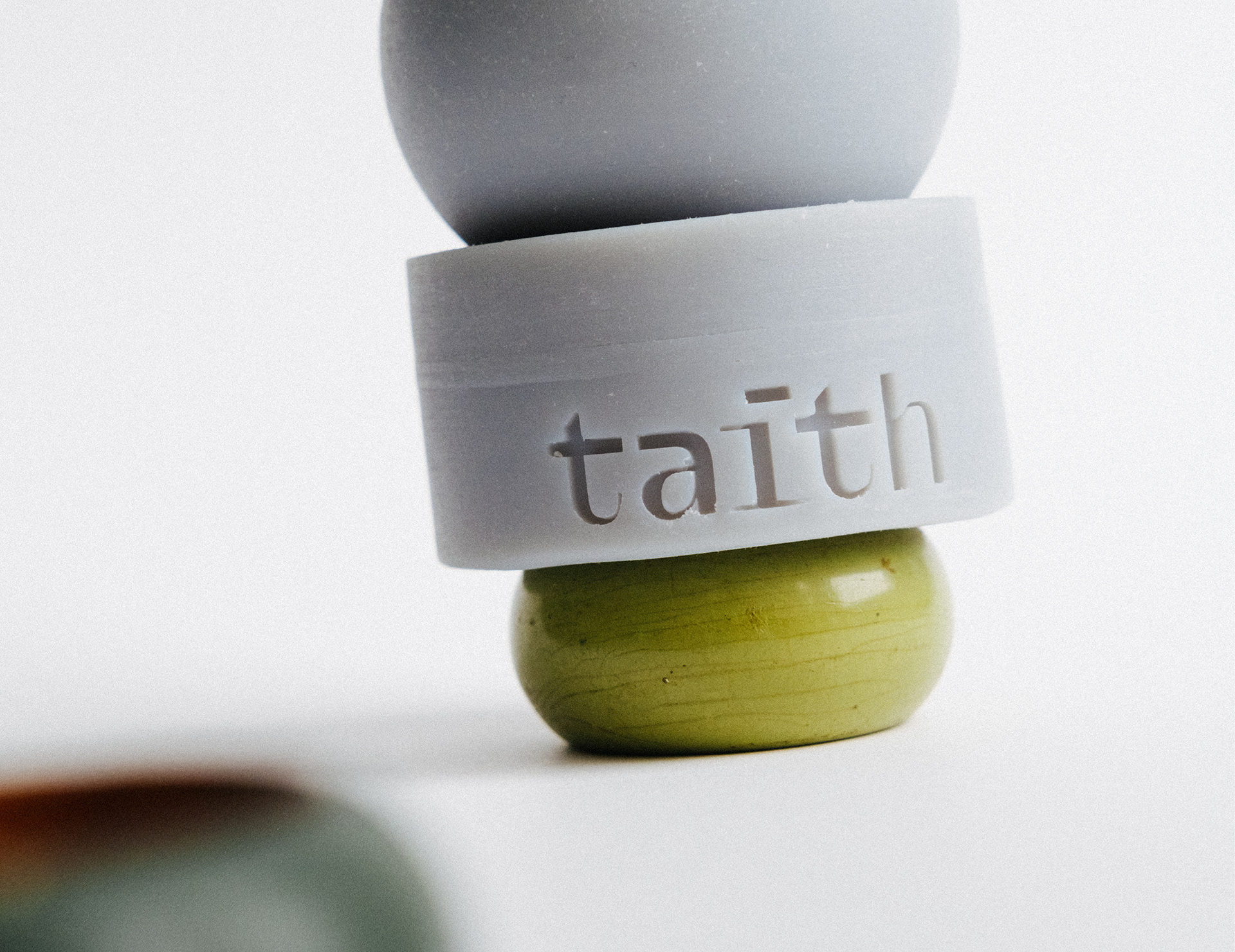
Client: The Taith — Welsh for "journey" — is a Warsaw-based studio making handcrafted candles, soaps, and creams. Small-batch, sculptural objects, sold through design-led retailers internationally.
Assignment: Design a wordmark for a product line whose objects are themselves sculptural — rounded, weighted, tactile. The mark had to sit on packaging and embossed into wax and soap without competing with the products, while carrying the meaning of the name.
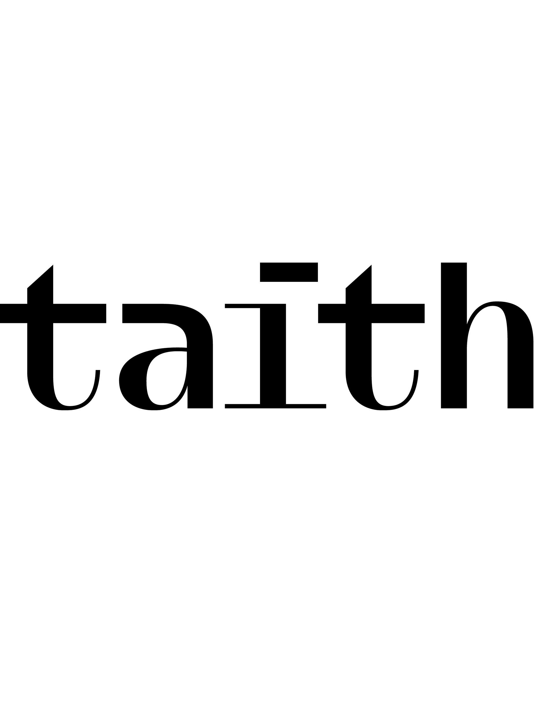
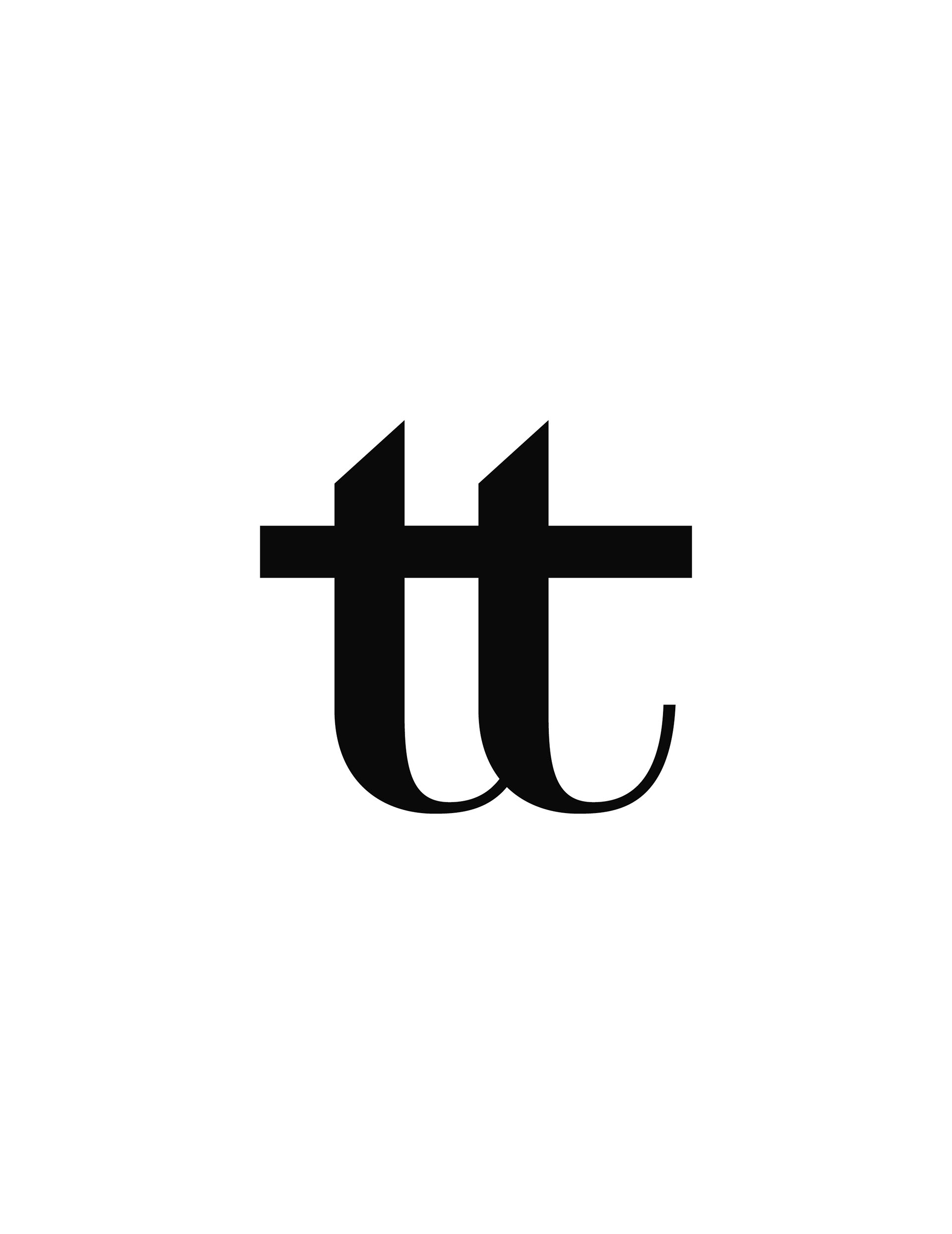
Solution & Process: W Clan GZA (Swiss Typefaces) sets the wordmark — a near-sans with subtle serif tension. The concept turns on a single detail: the "i" carries a one-sided serif that breaks the symmetry of the rest of the word. The serif works as a fork in the path — divergence, choice, the start of a journey. Taith means journey in Welsh; the mark says it in form. At small scale, embossed into a candle or printed in single-colour on packaging, that one detail is what makes the wordmark identifiable. Everything else stays quiet so the products and photography can lead.
Assignment: Design a wordmark for a product line whose objects are themselves sculptural — rounded, weighted, tactile. The mark had to sit on packaging and embossed into wax and soap without competing with the products, while carrying the meaning of the name.
Solution & Process: W Clan GZA (Swiss Typefaces) sets the wordmark — a near-sans with subtle serif tension. The concept turns on a single detail: the "i" carries a one-sided serif that breaks the symmetry of the rest of the word. The serif works as a fork in the path — divergence, choice, the start of a journey. Taith means journey in Welsh; the mark says it in form. At small scale, embossed into a candle or printed in single-colour on packaging, that one detail is what makes the wordmark identifiable. Everything else stays quiet so the products and photography can lead.
YEAR: 2023
ROLE: Wordmark, logo design
CLIENT: The Taith, Warsaw
TYPEFACE: W Clan GZA (Swiss Typefaces)
PHOTOGRAPHY: Zhanna Smetana
FEATURED: Vogue Polska
ROLE: Wordmark, logo design
CLIENT: The Taith, Warsaw
TYPEFACE: W Clan GZA (Swiss Typefaces)
PHOTOGRAPHY: Zhanna Smetana
FEATURED: Vogue Polska