FABIAN DARGATZ
Visual Identity, 2024
Visual Identity, 2024
Client: Fabian Dargatz is a Berlin-based Creative Director, filmmaker, and screenwriter. His work lives in moving image — how a frame is set, what's inside it, what's deliberately outside it.
Assignment: Build a personal identity for someone whose profession is, literally, framing. Most director-personal-brands lean on the wrong half of the craft — auteur photography, dark monograms, dramatic black-on-black. The mark needed to come from how Fabian works, not how directors are supposed to look.
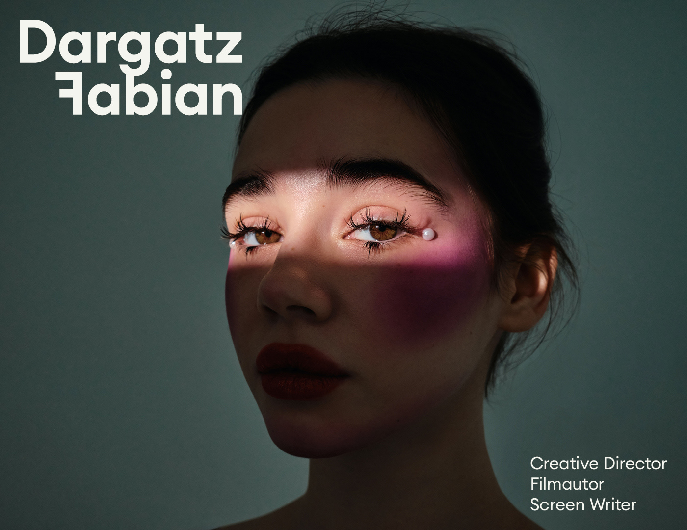
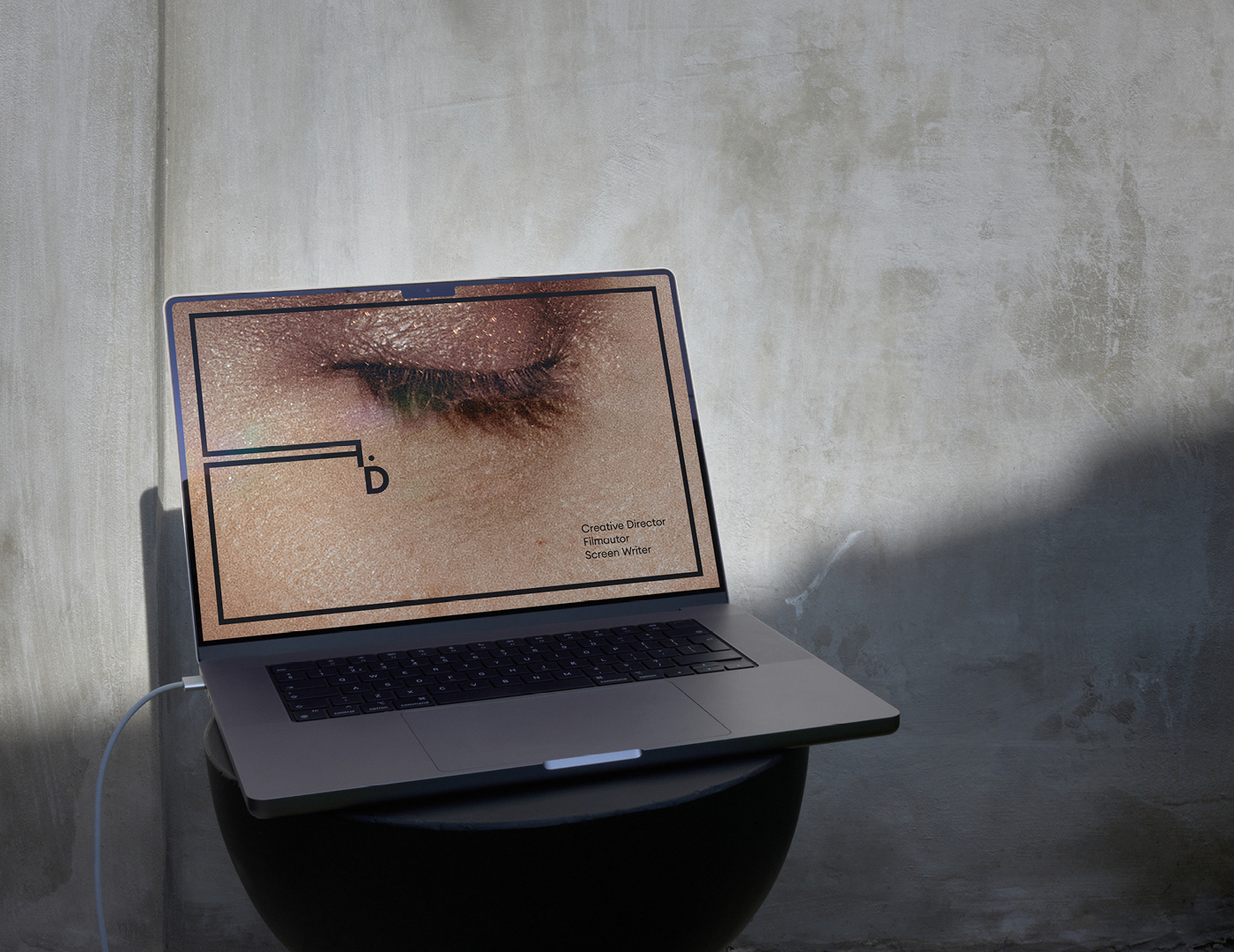
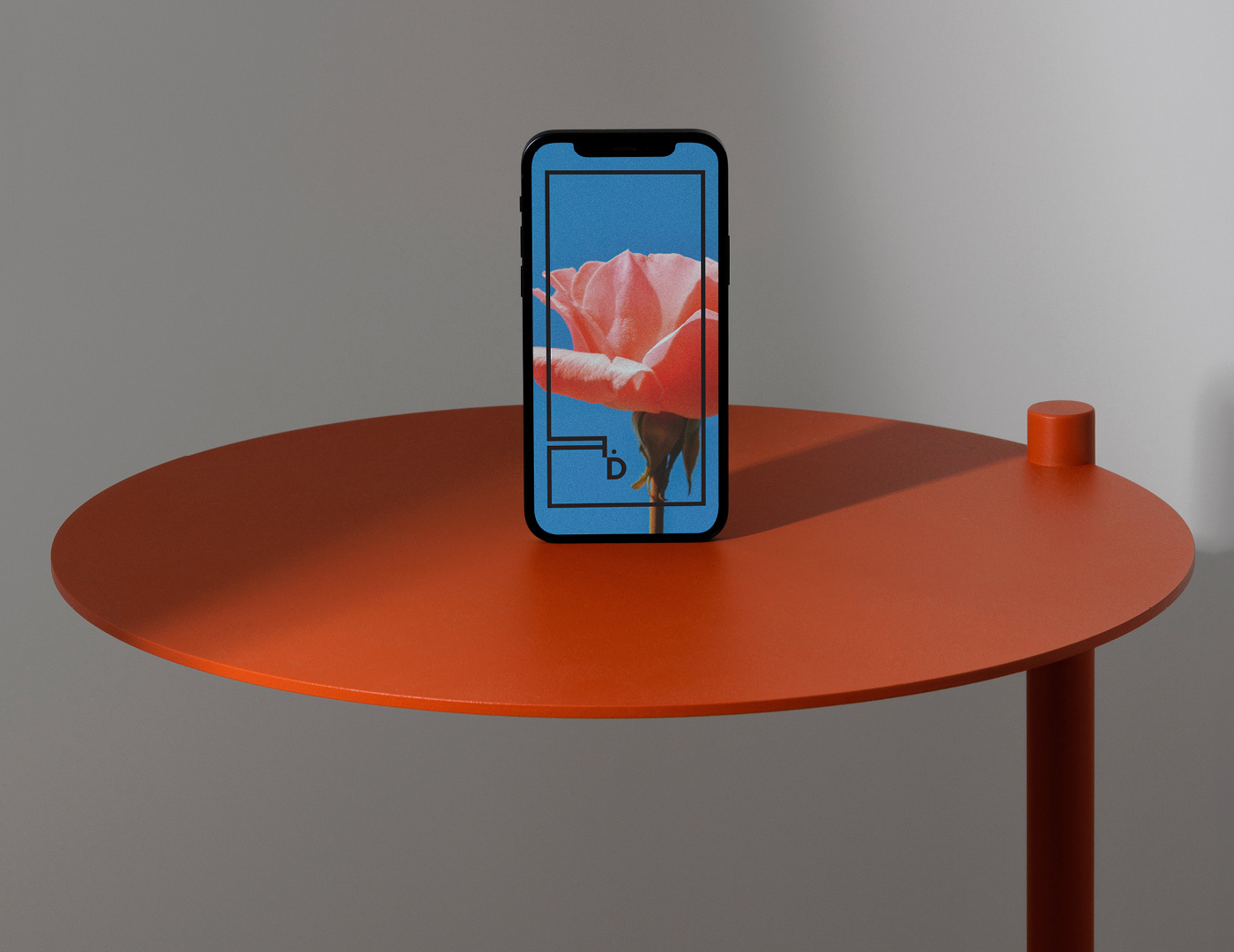
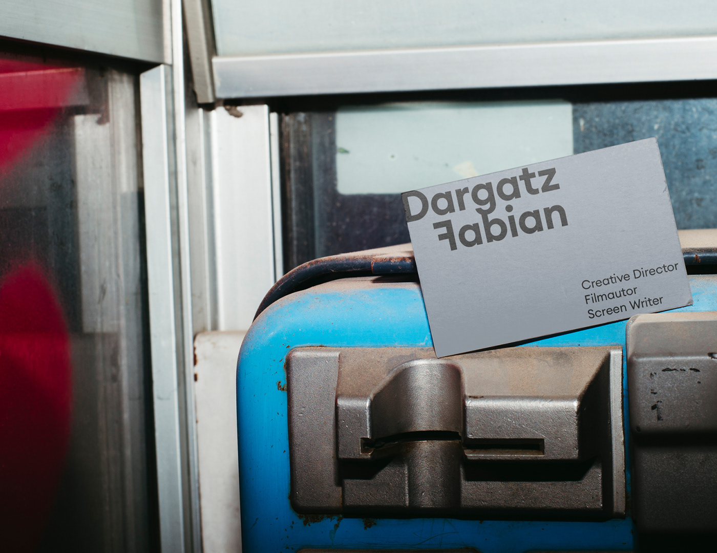
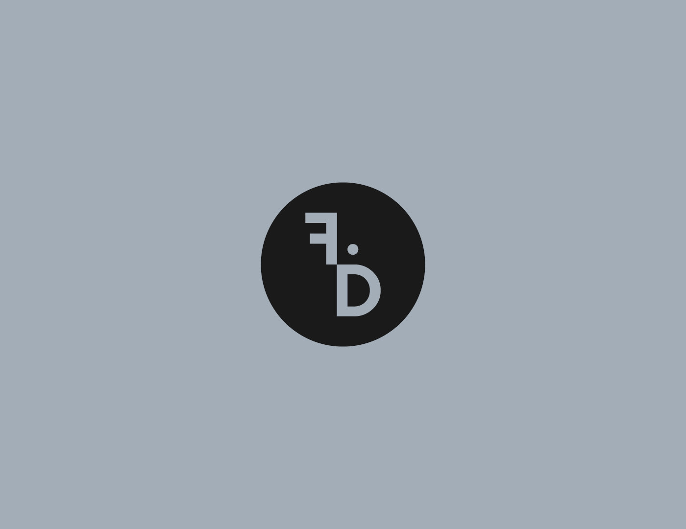
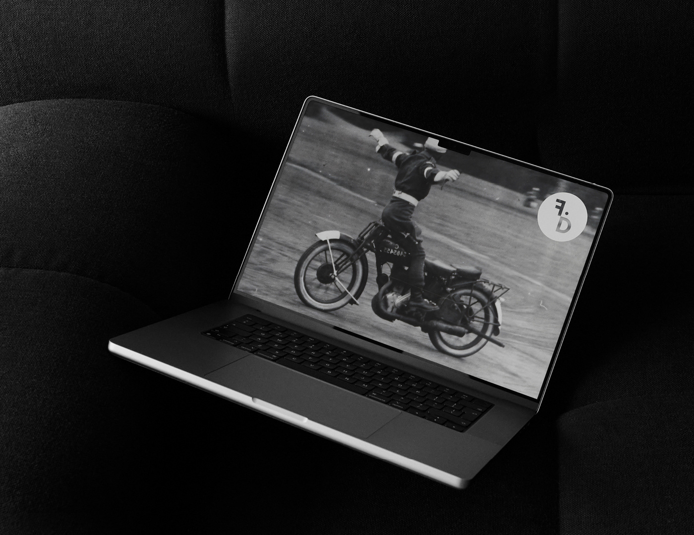
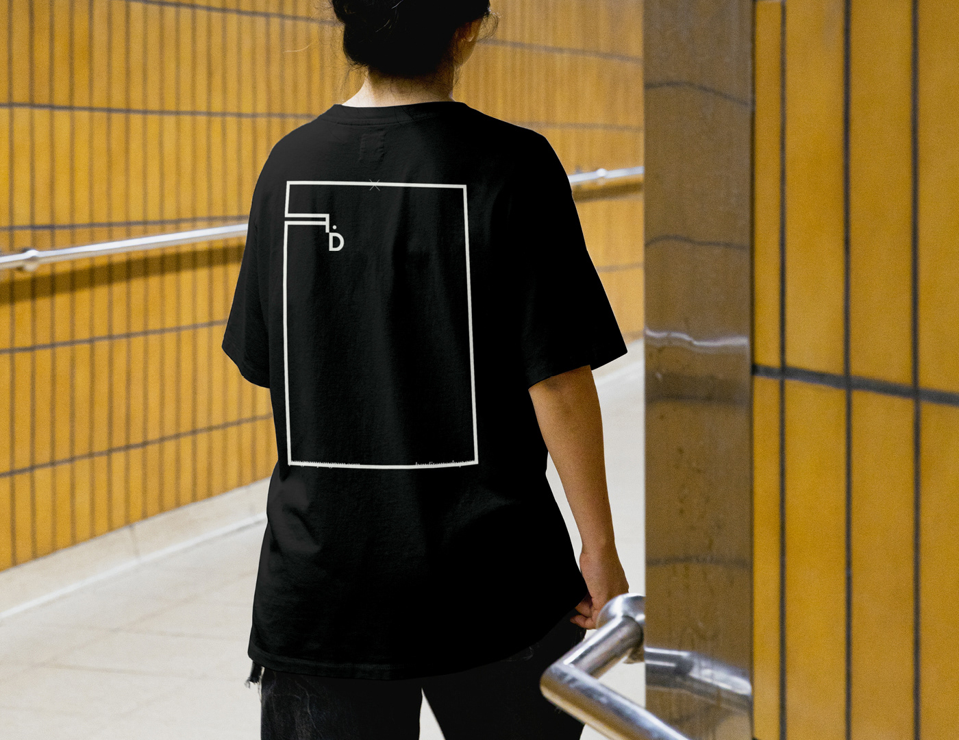
Solution & Process: The wordmark turns on one move: the F in Fabian is mirrored. Same letterform, flipped — the act of looking at something from the other side. A small dot beside the inverted F reads as a point of view, an eye, a camera. Together they form a corner — and the corner extends. Across the system, the F-and-dot detach from the wordmark and become a frame: a rectangle that wraps around a still, a photograph, a music video frame, a face. The logo doesn't sit on the work — it tells you how to look at it. The viewer becomes the camera; Fabian becomes the one setting the angle.
Euclid Circular A (Swiss Typefaces) sets the typography — geometric and neutral enough that the inverted F reads as deliberate, not decorative.
Assignment: Build a personal identity for someone whose profession is, literally, framing. Most director-personal-brands lean on the wrong half of the craft — auteur photography, dark monograms, dramatic black-on-black. The mark needed to come from how Fabian works, not how directors are supposed to look.
Solution & Process: The wordmark turns on one move: the F in Fabian is mirrored. Same letterform, flipped — the act of looking at something from the other side. A small dot beside the inverted F reads as a point of view, an eye, a camera. Together they form a corner — and the corner extends. Across the system, the F-and-dot detach from the wordmark and become a frame: a rectangle that wraps around a still, a photograph, a music video frame, a face. The logo doesn't sit on the work — it tells you how to look at it. The viewer becomes the camera; Fabian becomes the one setting the angle.
Euclid Circular A (Swiss Typefaces) sets the typography — geometric and neutral enough that the inverted F reads as deliberate, not decorative.
YEAR: 2024
ROLE: Visual identity, art direction, graphic design
CLIENT: Fabian Dargatz / Creative Director / Filmmaker / Screenwriter
TYPEFACE: Euclid Circular A (Swiss Typefaces)
ROLE: Visual identity, art direction, graphic design
CLIENT: Fabian Dargatz / Creative Director / Filmmaker / Screenwriter
TYPEFACE: Euclid Circular A (Swiss Typefaces)