VERWANDLUNG
Editorial & Type Design, 2019
Editorial & Type Design, 2019
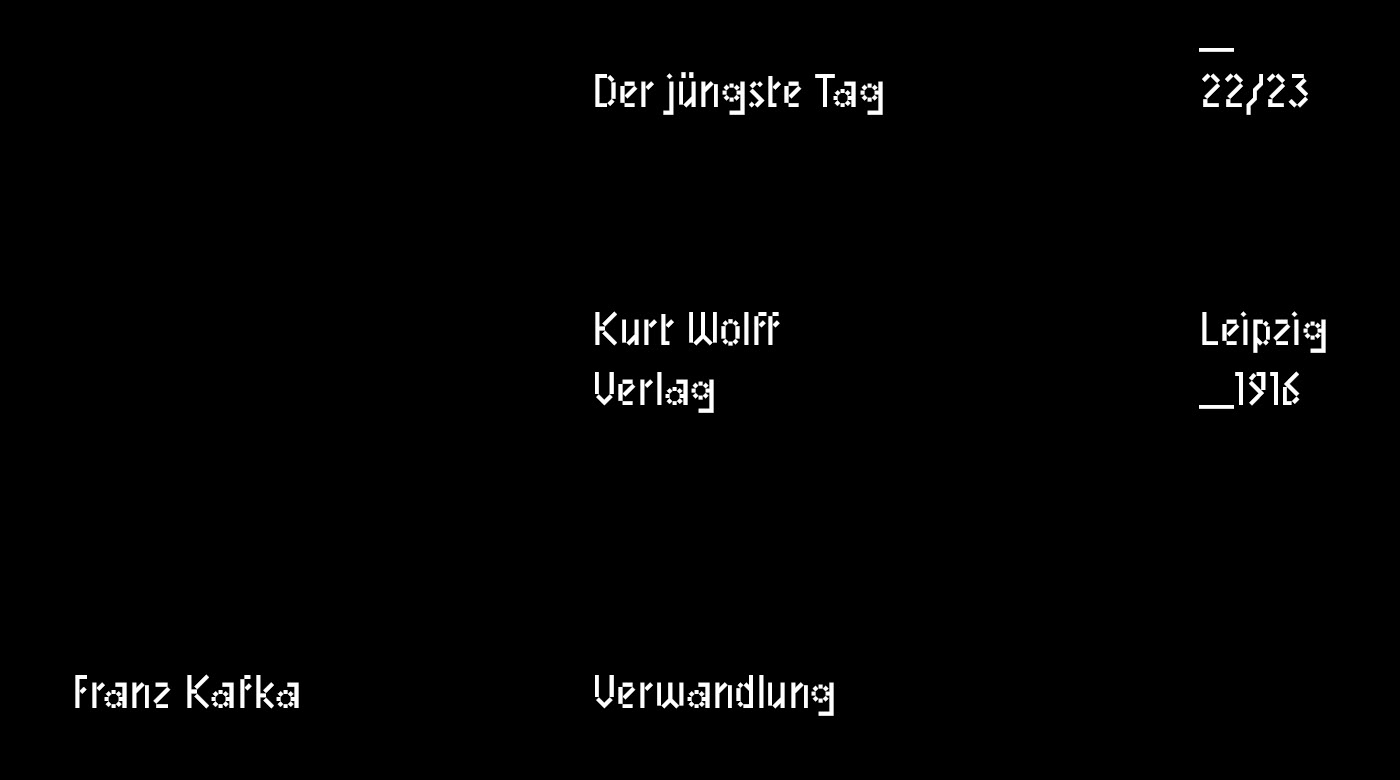
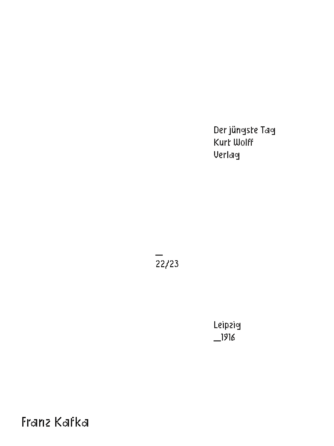
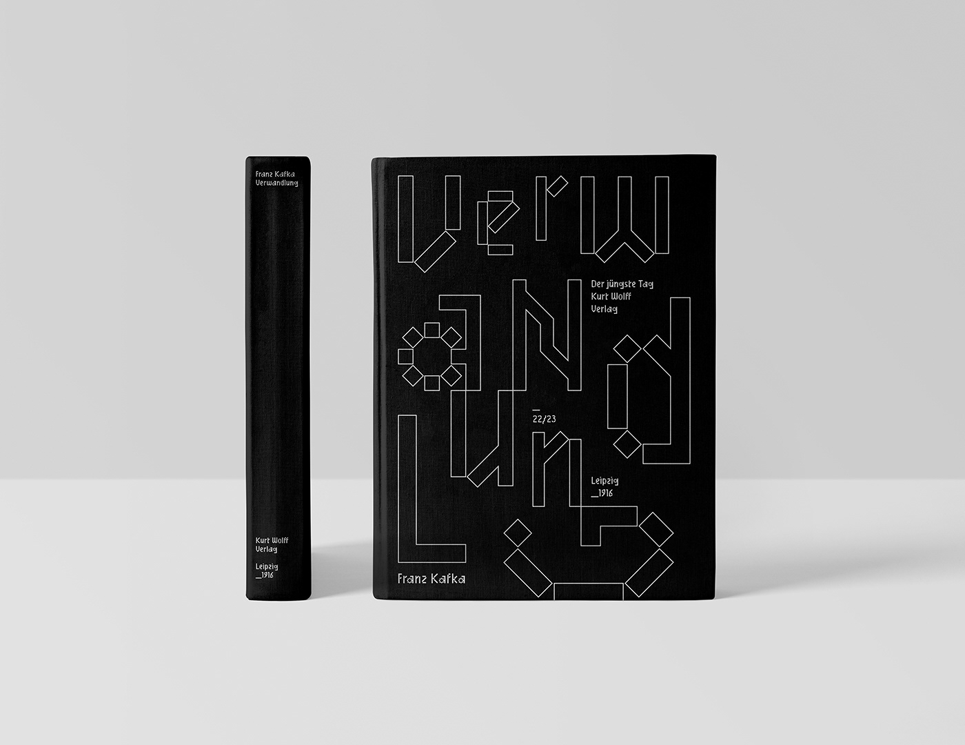
Client: Franz Kafka's Die Verwandlung — The Metamorphosis — first published October 1915 in the avant-garde magazine Die weißen Blätter, then released in book format by Kurt Wolff Verlag, Leipzig. A novella about a man waking up transformed into something he cannot recognise.
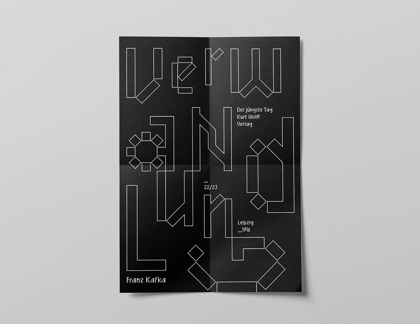
Assignment: A self-initiated reissue concept: book cover and inlay poster for Die Verwandlung. The brief I set myself was to find a typographic form that doesn't illustrate the story — no insect, no shadow — but enacts the central act of the novella through the letterforms themselves.
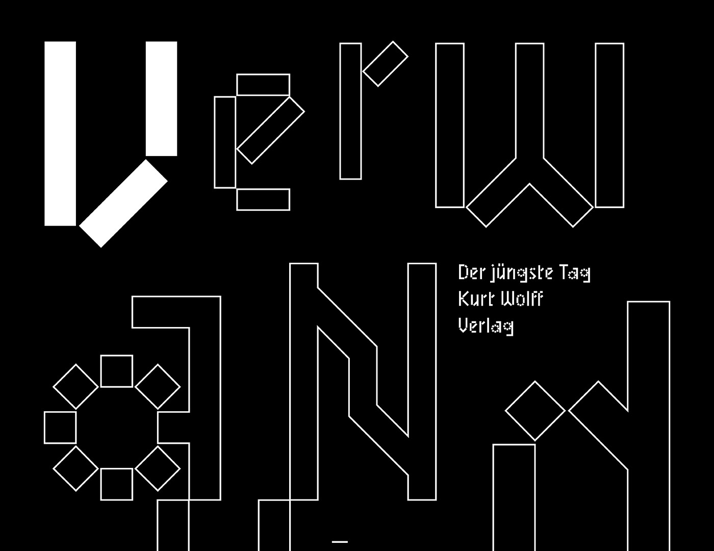
Solution & Process: The work turns on a single typographic choice – Mineral, a geometric Blackletter by BB-Bureau, in which the historical script form is reconstructed from modular geometric units — squares, diagonals, dots. The letters are simultaneously medieval and modular, recognisable and uncanny, the same character built from incompatible logics. The transformation is in the typography itself. Cover and inlay poster compose Mineral at scale, letting the typeface carry the meaning without illustration. Black and white only, set in tight grids — the form does the work.
Assignment: A self-initiated reissue concept: book cover and inlay poster for Die Verwandlung. The brief I set myself was to find a typographic form that doesn't illustrate the story — no insect, no shadow — but enacts the central act of the novella through the letterforms themselves.
Solution & Process: The work turns on a single typographic choice – Mineral, a geometric Blackletter by BB-Bureau, in which the historical script form is reconstructed from modular geometric units — squares, diagonals, dots. The letters are simultaneously medieval and modular, recognisable and uncanny, the same character built from incompatible logics. The transformation is in the typography itself. Cover and inlay poster compose Mineral at scale, letting the typeface carry the meaning without illustration. Black and white only, set in tight grids — the form does the work.
YEAR: 2019
ROLE: Concept, typography, book and poster design
TYPE: Self-initiated
TYPEFACE: Mineral (BB-Bureau)
ROLE: Concept, typography, book and poster design
TYPE: Self-initiated
TYPEFACE: Mineral (BB-Bureau)