LISBOA CAFÉ
Visual Identity, 2021
Visual Identity, 2021
Client: Lisboa Café is a Hanover café and wine bar serving Portuguese pastries, tapas, and wine. A small, place-bound business translating the everyday rhythm of Lisbon coffee culture to a German city.
Assignment: Design an identity for a café whose business sits between two registers: weekday morning coffee and pastéis de nata on one side, evening tapas and Portuguese wine on the other. The brand had to work for both without splitting in two — and had to read as Portuguese without leaning on flag colours or tourist clichés.
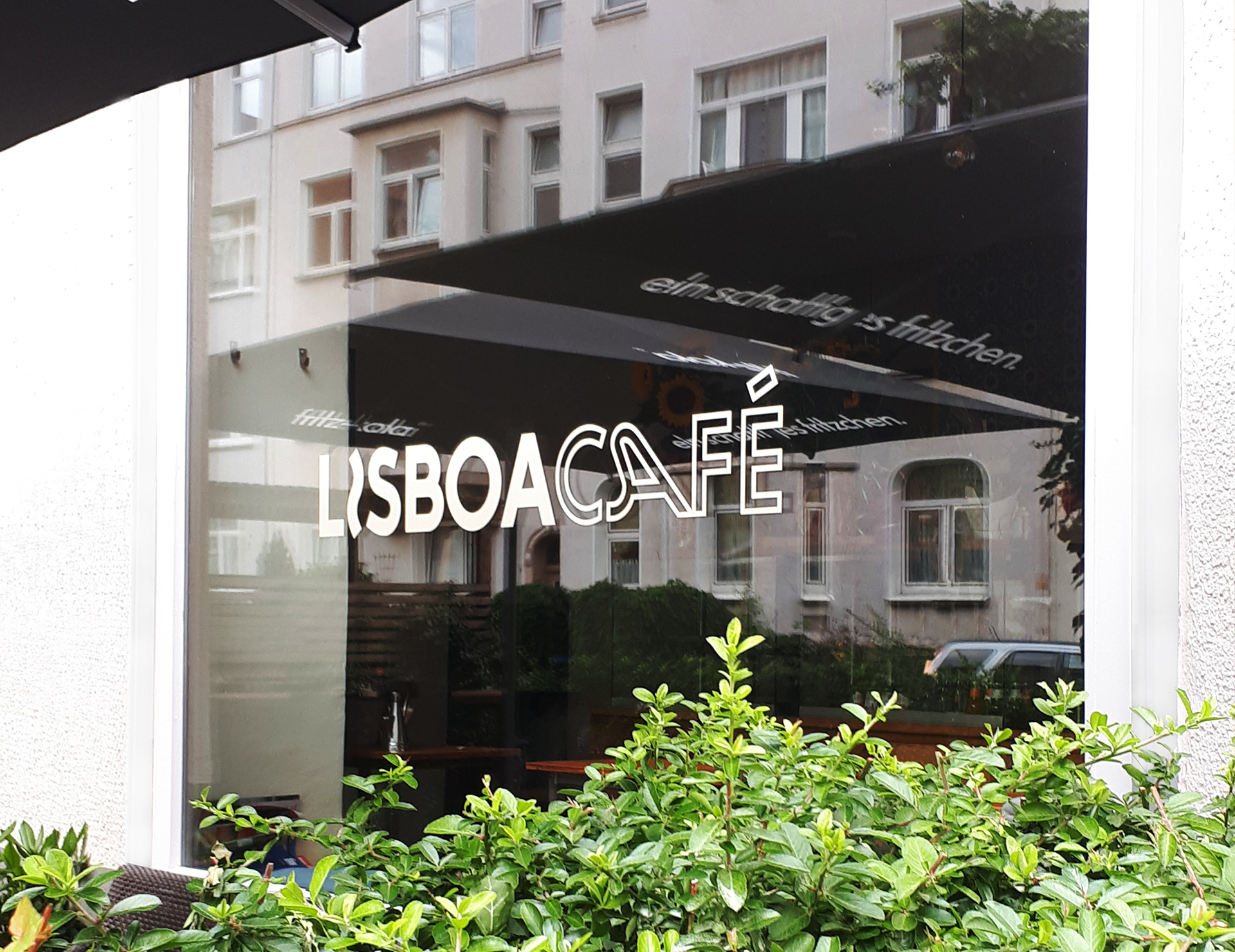
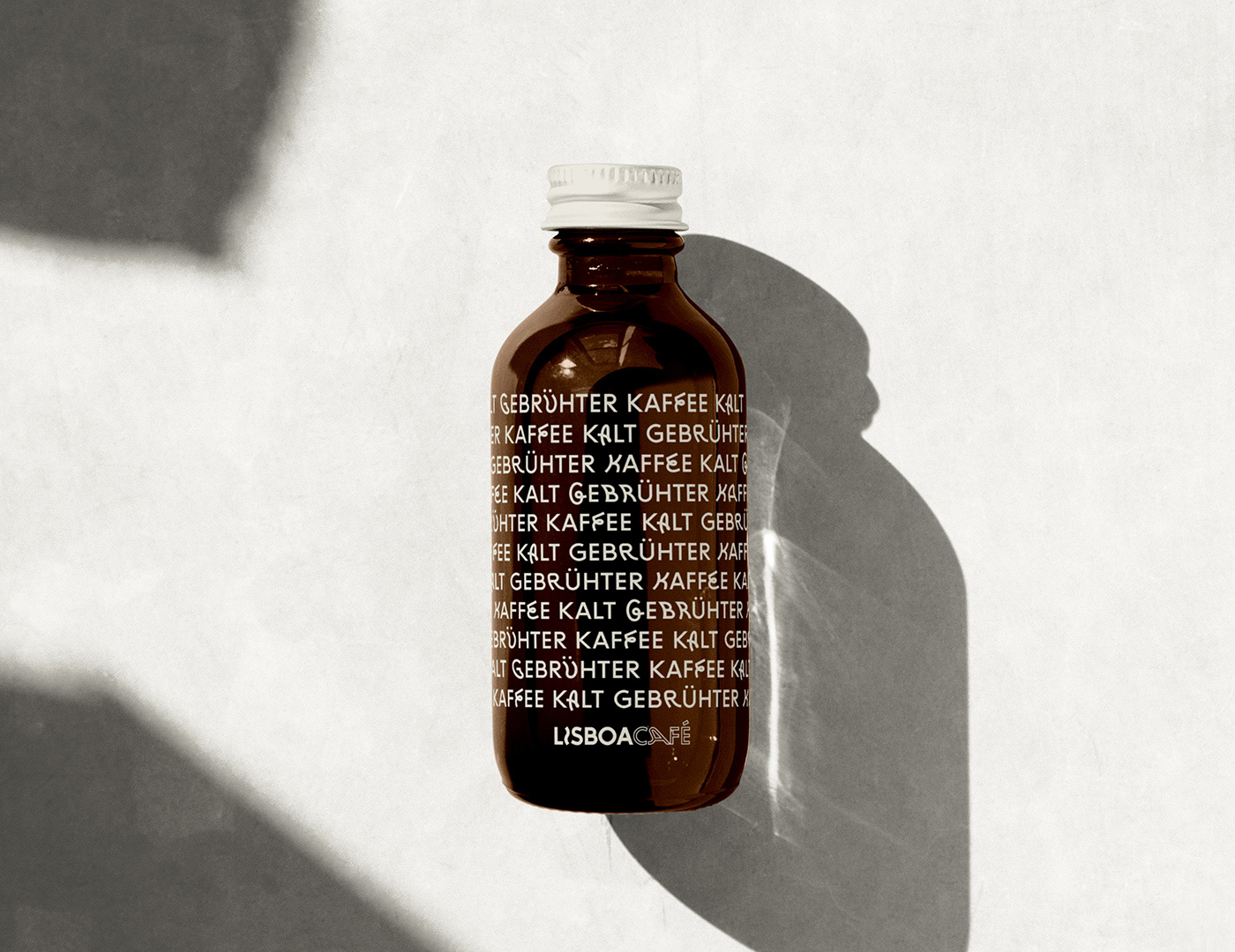
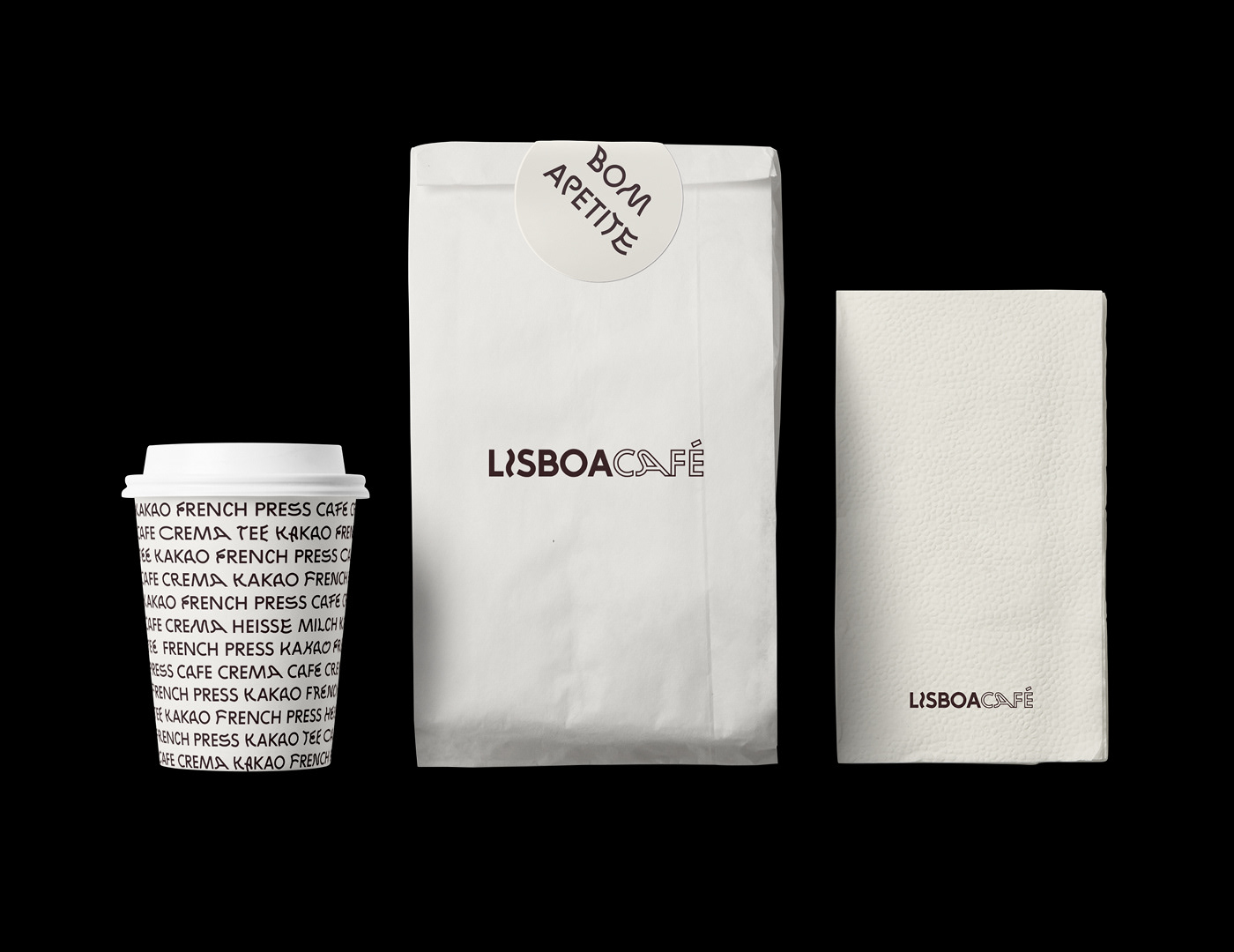
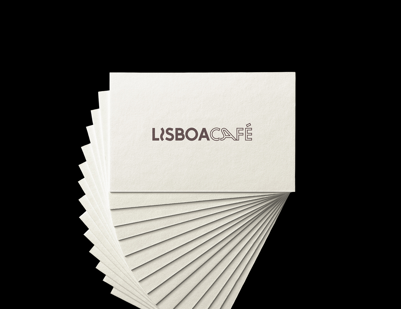
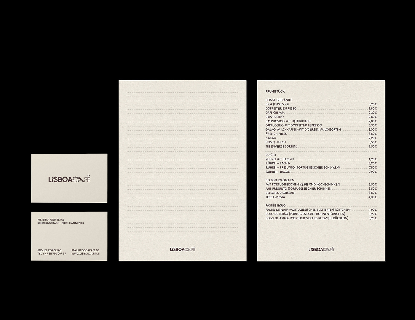
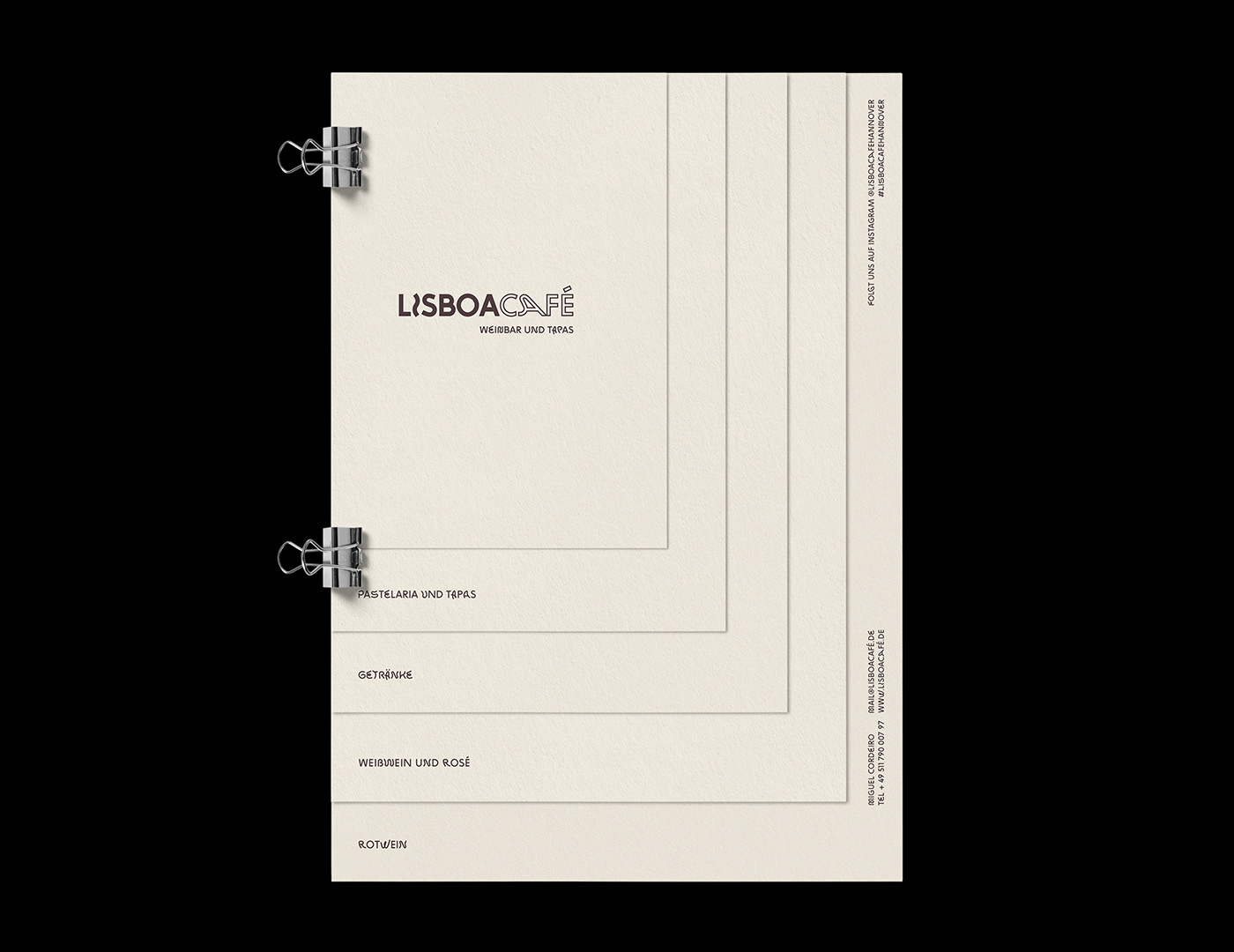
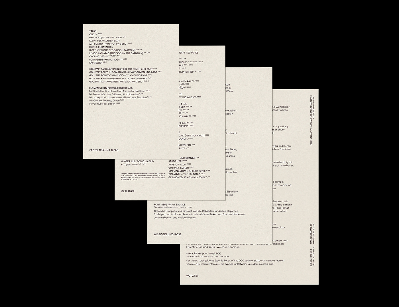
Solution & Process: The reference point is azulejo — the painted ceramic tile that lines Portuguese kitchens, hallways, and cafés. Not borrowed as ornament, but absorbed into the system's logic: typographic composition as tile pattern. The wordmark joins Lisboa and Café through a single ligature — the "C" of Café enters the "A" of Lisboa — locking the name into one continuous form, the way a tile motif locks into the next. Zig Zag Not Rounded (Benoît Bodhuin) carries it: a quirky sans with enough character to feel hand-set, not corporate. Menus, stickers, packaging stay restrained — cream paper, single-colour print, dense typographic grids that read as tile fields. Place-bound, quiet, recognisably Portuguese without saying so.
Assignment: Design an identity for a café whose business sits between two registers: weekday morning coffee and pastéis de nata on one side, evening tapas and Portuguese wine on the other. The brand had to work for both without splitting in two — and had to read as Portuguese without leaning on flag colours or tourist clichés.
Solution & Process: The reference point is azulejo — the painted ceramic tile that lines Portuguese kitchens, hallways, and cafés. Not borrowed as ornament, but absorbed into the system's logic: typographic composition as tile pattern. The wordmark joins Lisboa and Café through a single ligature — the "C" of Café enters the "A" of Lisboa — locking the name into one continuous form, the way a tile motif locks into the next. Zig Zag Not Rounded (Benoît Bodhuin) carries it: a quirky sans with enough character to feel hand-set, not corporate. Menus, stickers, packaging stay restrained — cream paper, single-colour print, dense typographic grids that read as tile fields. Place-bound, quiet, recognisably Portuguese without saying so.
YEAR: 2021
ROLE: Art direction, Graphic design, layout
CLIENT: Lisboa Café, Hanover, Germany
TYPEFACE: Zig Zag Not Rounded (BB-Bureau)
ROLE: Art direction, Graphic design, layout
CLIENT: Lisboa Café, Hanover, Germany
TYPEFACE: Zig Zag Not Rounded (BB-Bureau)