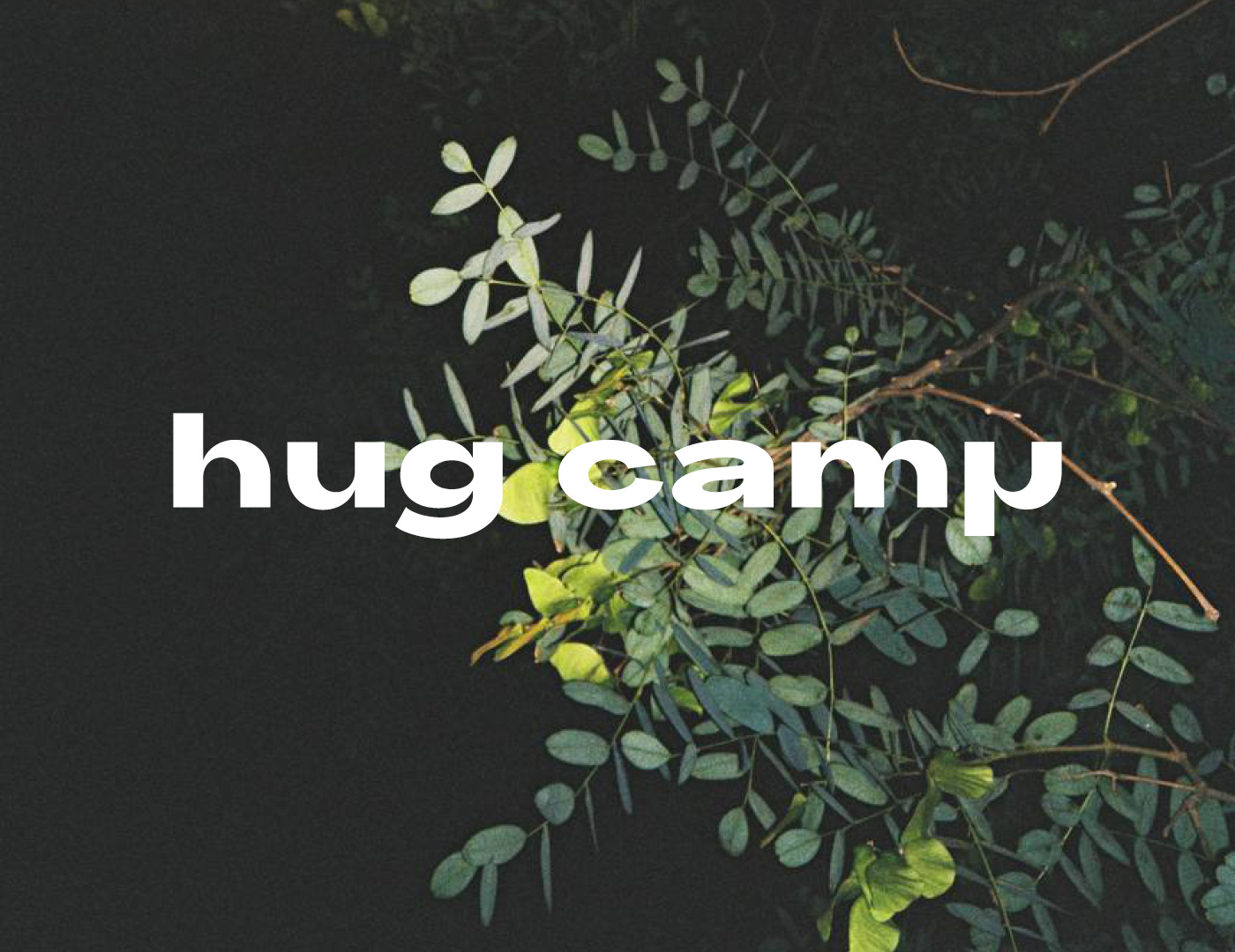
HUG CAMP, MADEIRA
Brand Identity, 2024
Brand Identity, 2024
Client: Hug Camp runs surfing, yoga, and hiking retreats on Madeira. The format mixes the three disciplines into structured weekly camps — guided sessions in the morning, the Atlantic and the mountains the rest of the day.
Assignment: Build an identity for an activity-based retreat that didn't lean on wellness-brand defaults — sans-serif lowercase logo over a sunset photograph, beige palette, hand-drawn icons of yoga poses. Hug Camp's draw is movement and place, not aesthetic calm. The brand needed to express that without falling into either the fitness register or the spa register.
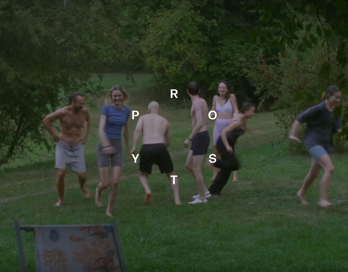
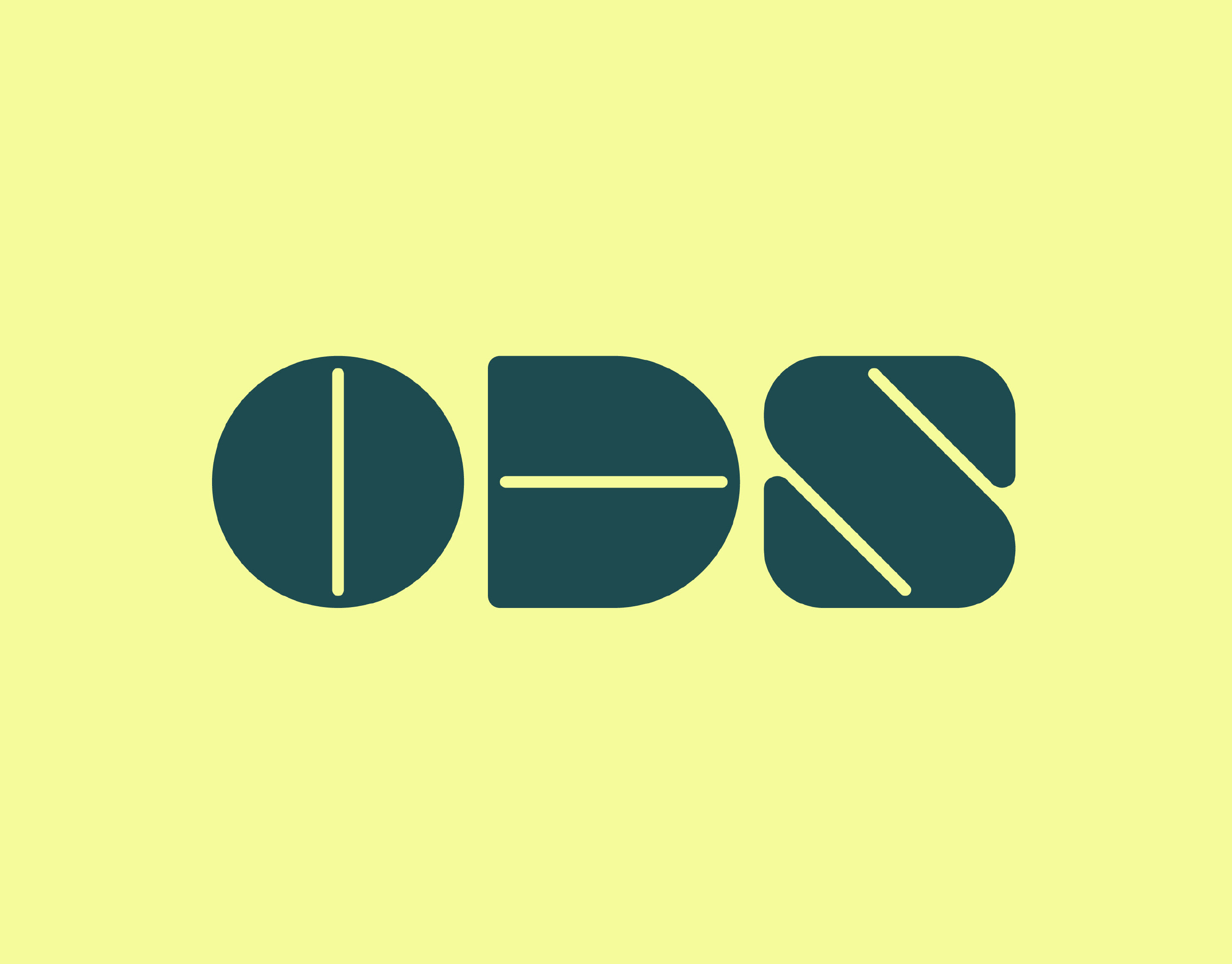
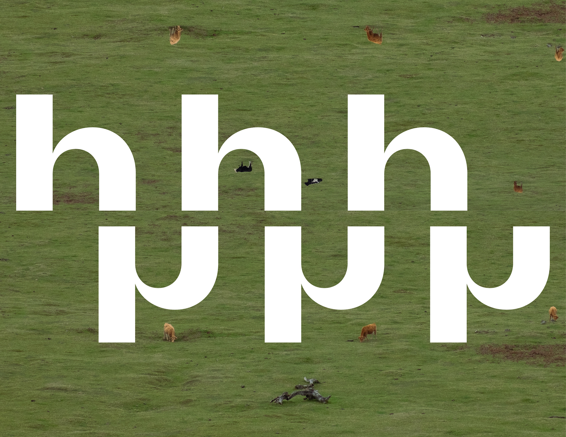
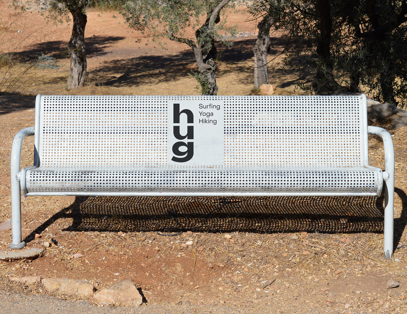
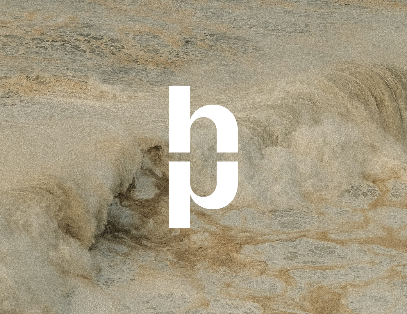
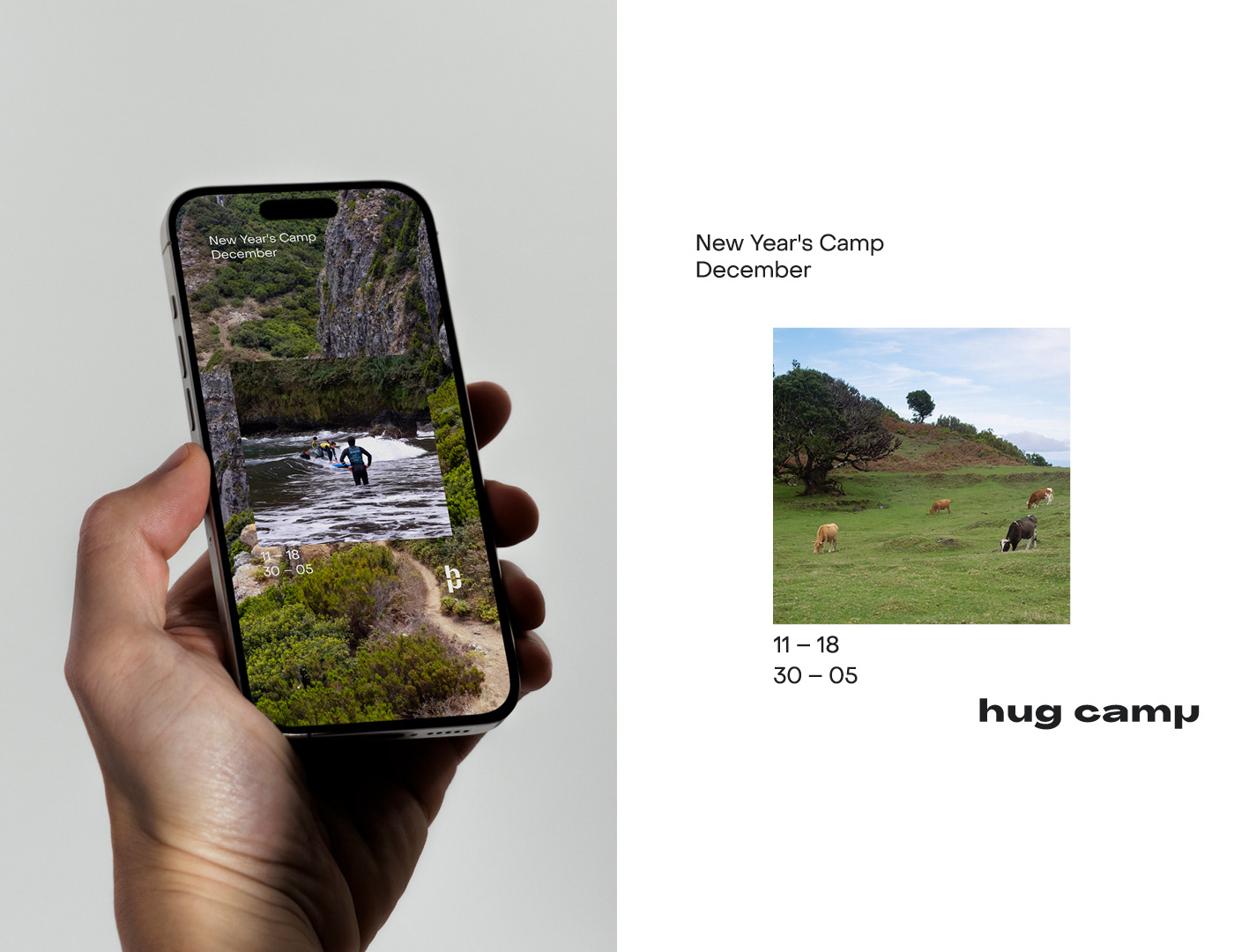
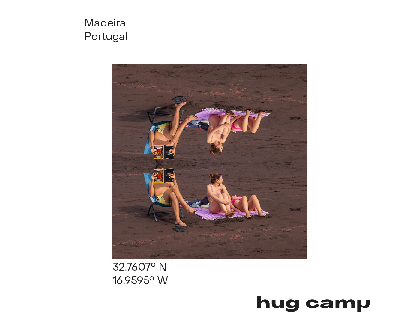
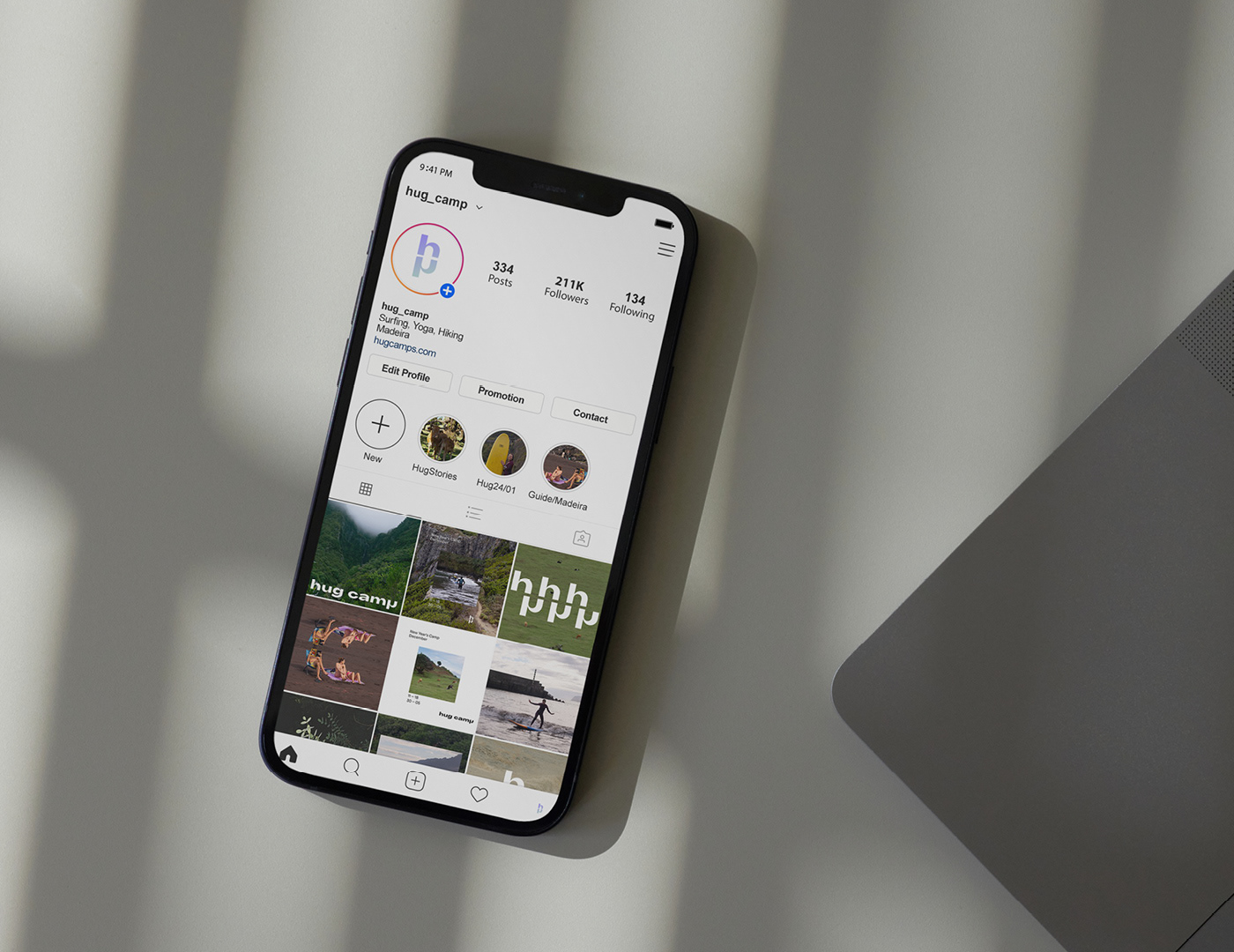
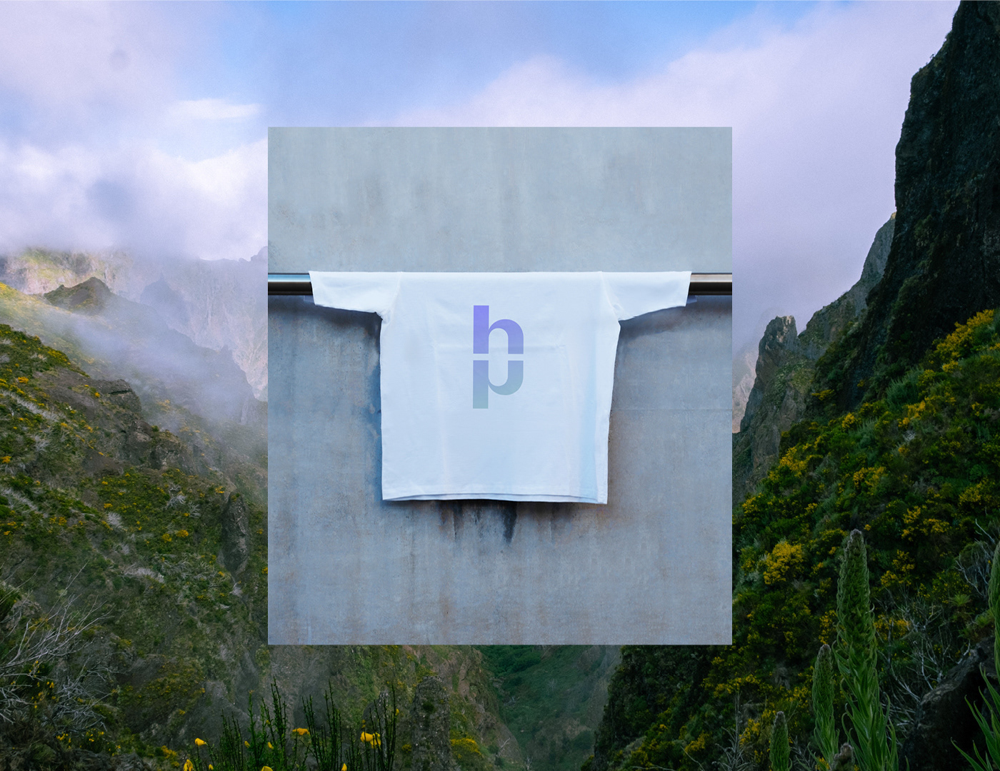
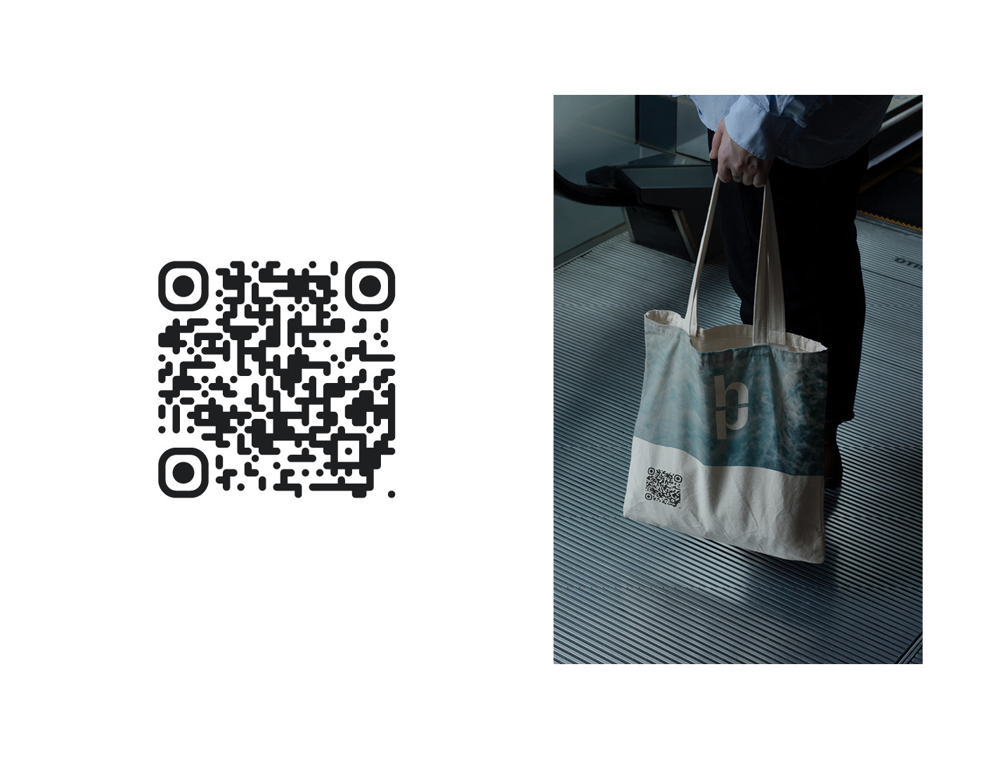
Solution & Process: The wordmark turns on a single geometric move: the "h" mirrored becomes a "p" — same shape, flipped along the baseline. Two letters from one form, joined as an embrace, which is also where the name lands. But the real system isn't the logo on its own — it's what happens when h and p repeat. Stacked or rowed, they form continuous curves: a wave, a hiking trail, the arc of a yoga movement. The same mark reads as all three disciplines depending on context. Object Sans sets the typography — its geometric monoline construction is built on the same logic as the mark itself, so wordmark and supporting type stay internally consistent. Madeira's landscapes carry the photography; pattern and signage extend the system without leaning on illustration or icon sets.
Assignment: Build an identity for an activity-based retreat that didn't lean on wellness-brand defaults — sans-serif lowercase logo over a sunset photograph, beige palette, hand-drawn icons of yoga poses. Hug Camp's draw is movement and place, not aesthetic calm. The brand needed to express that without falling into either the fitness register or the spa register.
Solution & Process: The wordmark turns on a single geometric move: the "h" mirrored becomes a "p" — same shape, flipped along the baseline. Two letters from one form, joined as an embrace, which is also where the name lands. But the real system isn't the logo on its own — it's what happens when h and p repeat. Stacked or rowed, they form continuous curves: a wave, a hiking trail, the arc of a yoga movement. The same mark reads as all three disciplines depending on context. Object Sans sets the typography — its geometric monoline construction is built on the same logic as the mark itself, so wordmark and supporting type stay internally consistent. Madeira's landscapes carry the photography; pattern and signage extend the system without leaning on illustration or icon sets.
YEAR: 2024
ROLE: Visual identity, art direction, graphic design
CLIENT: Hug Camp, Madeira
TYPEFACE: Object Sans (Pangram Pangram Foundry)
ROLE: Visual identity, art direction, graphic design
CLIENT: Hug Camp, Madeira
TYPEFACE: Object Sans (Pangram Pangram Foundry)