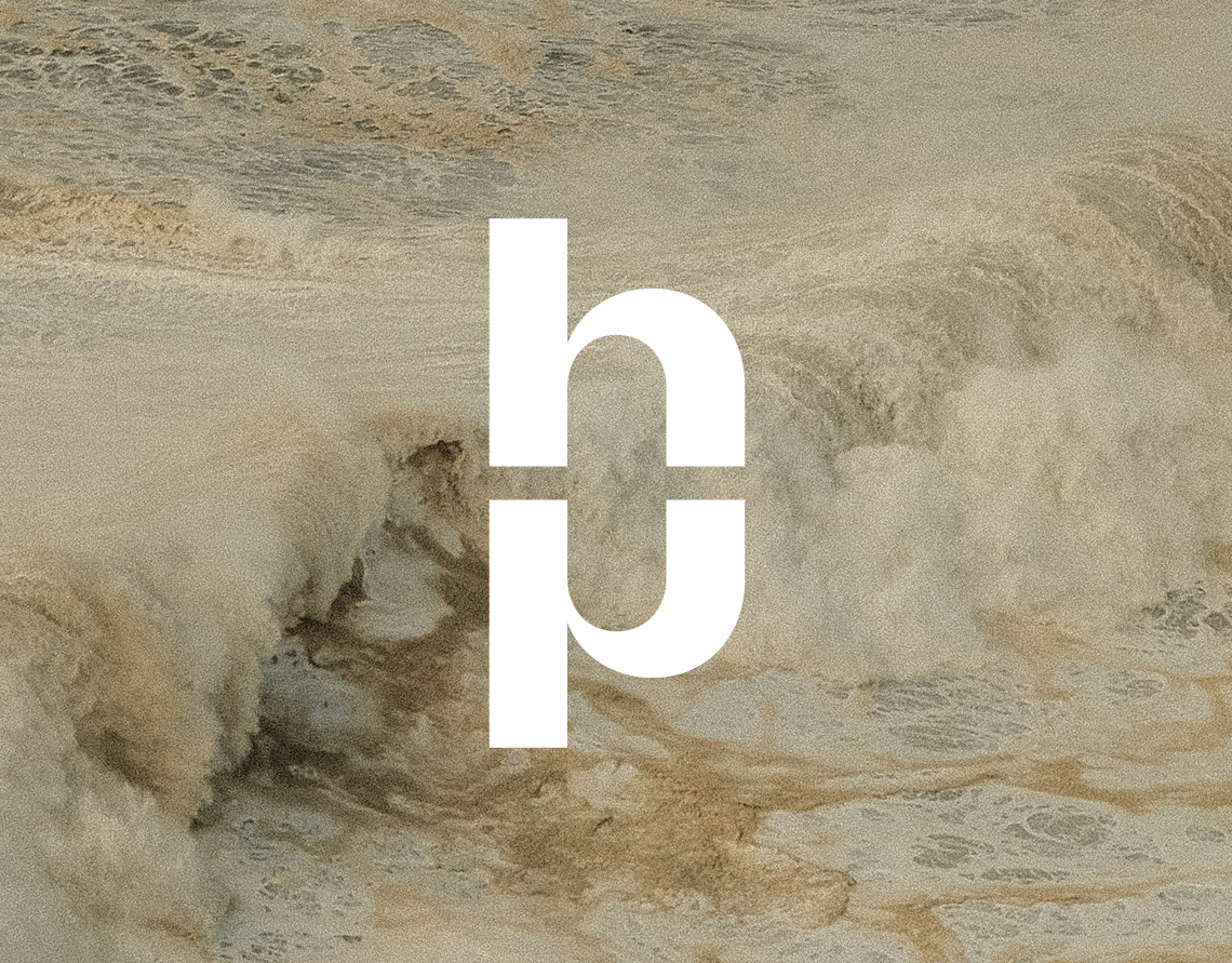
Nobody asked, but I made two marks: 1. the symbol – a bolt, a flash – the very essence of fast-paced Zhanna. 2. the abbreviation: I ended up really liking both (which is rare for me), so we decided to keep them. Two colors: orange – construction, caution tape, barriers. all because Zhanna loves using these elements in her work: green – nature, flora, everything not made by human hands. also a frequent guest in her shots
My favorite trick here – the grid: it’s a subtle nod to the photographic grid, the guiding points for composition both in frame and in the overall set design. Surprise! another touch – sketching, one of Zhanna’s signature moves. that perfectly imperfect vibe that really captures her style. Two fonts: both solid choices
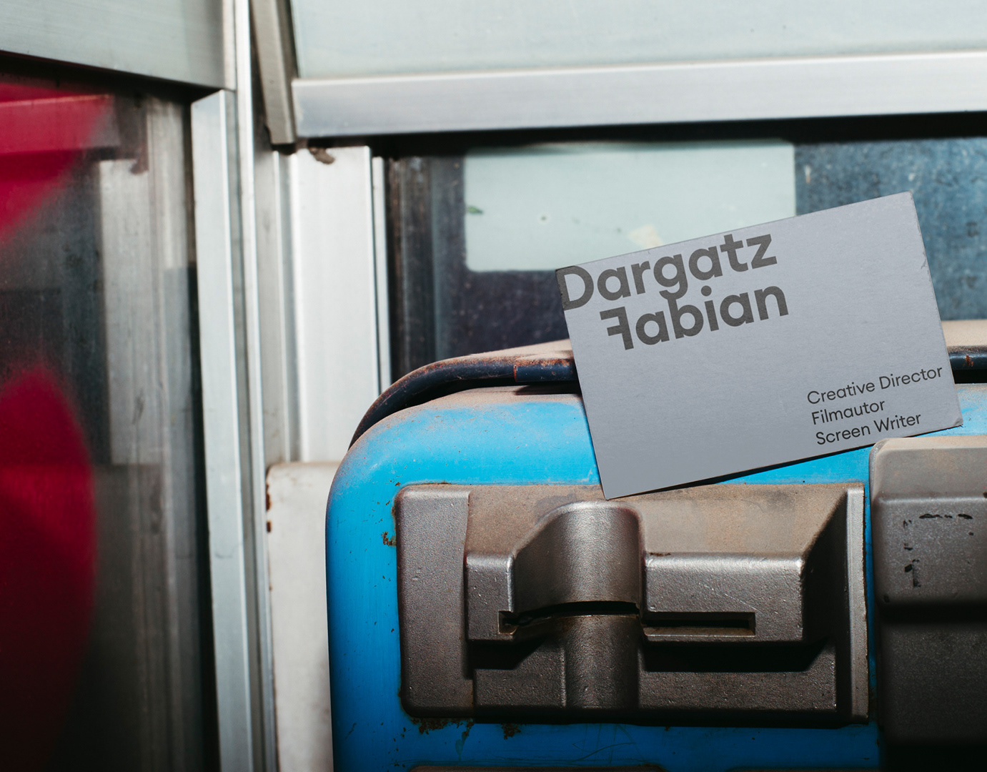
Business cards: decided not to stick to just one motif here, went with a few different shots + love how clean and bold the symbol looks on the back. Presentation for consultations
turned out pretty cool
Client: zhannasmetana
Layout, Graphic Design: Vitaliy Guryn
Layout, Graphic Design: Vitaliy Guryn
