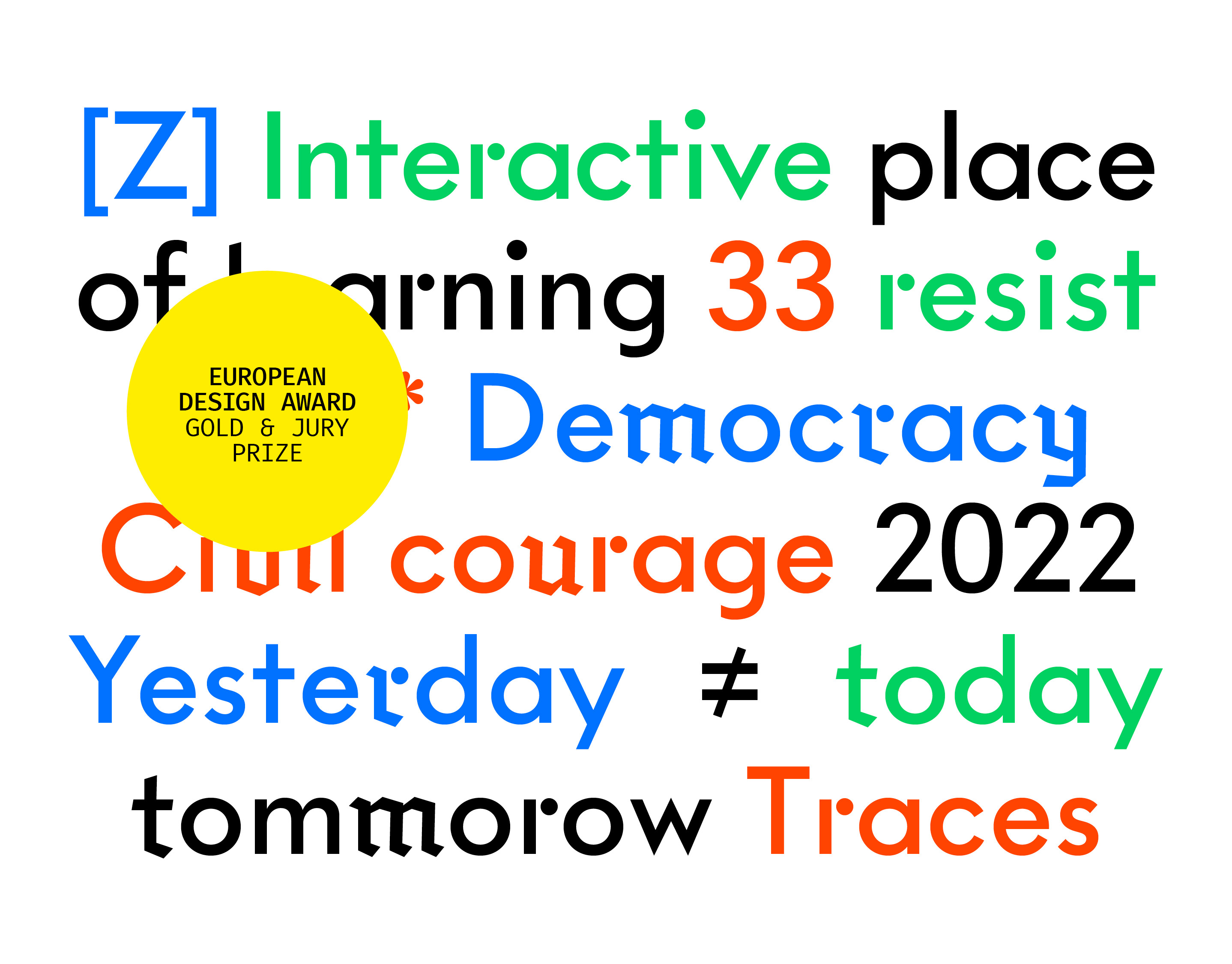
ODS
Brand Identity & Web Design, 2024
Brand Identity & Web Design, 2024
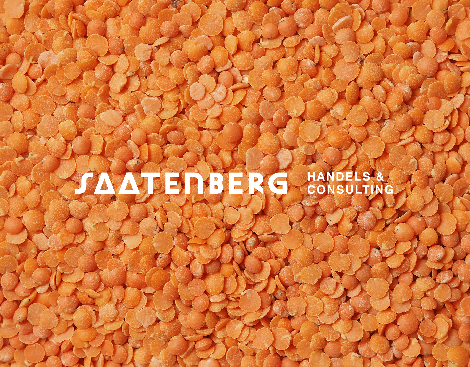
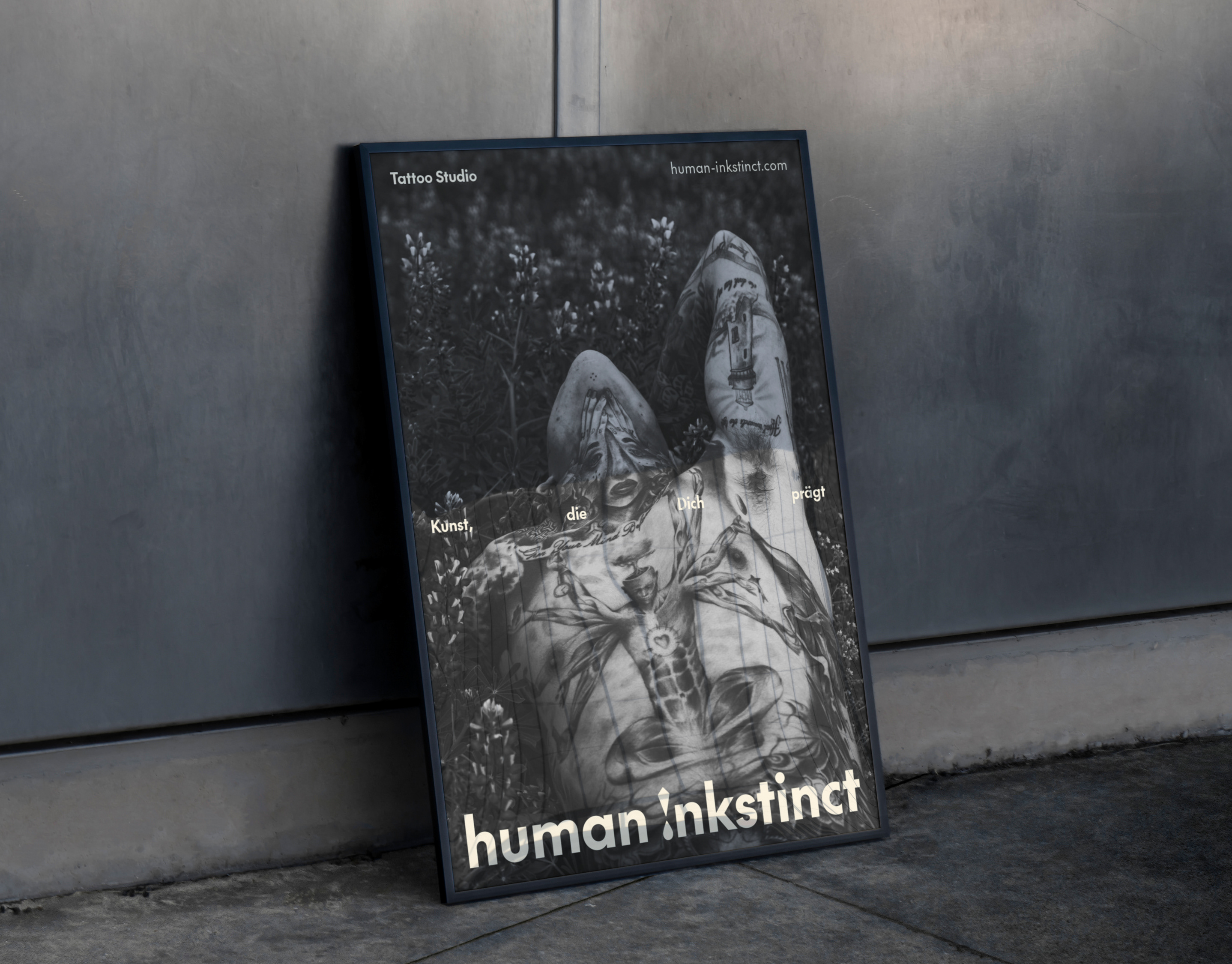
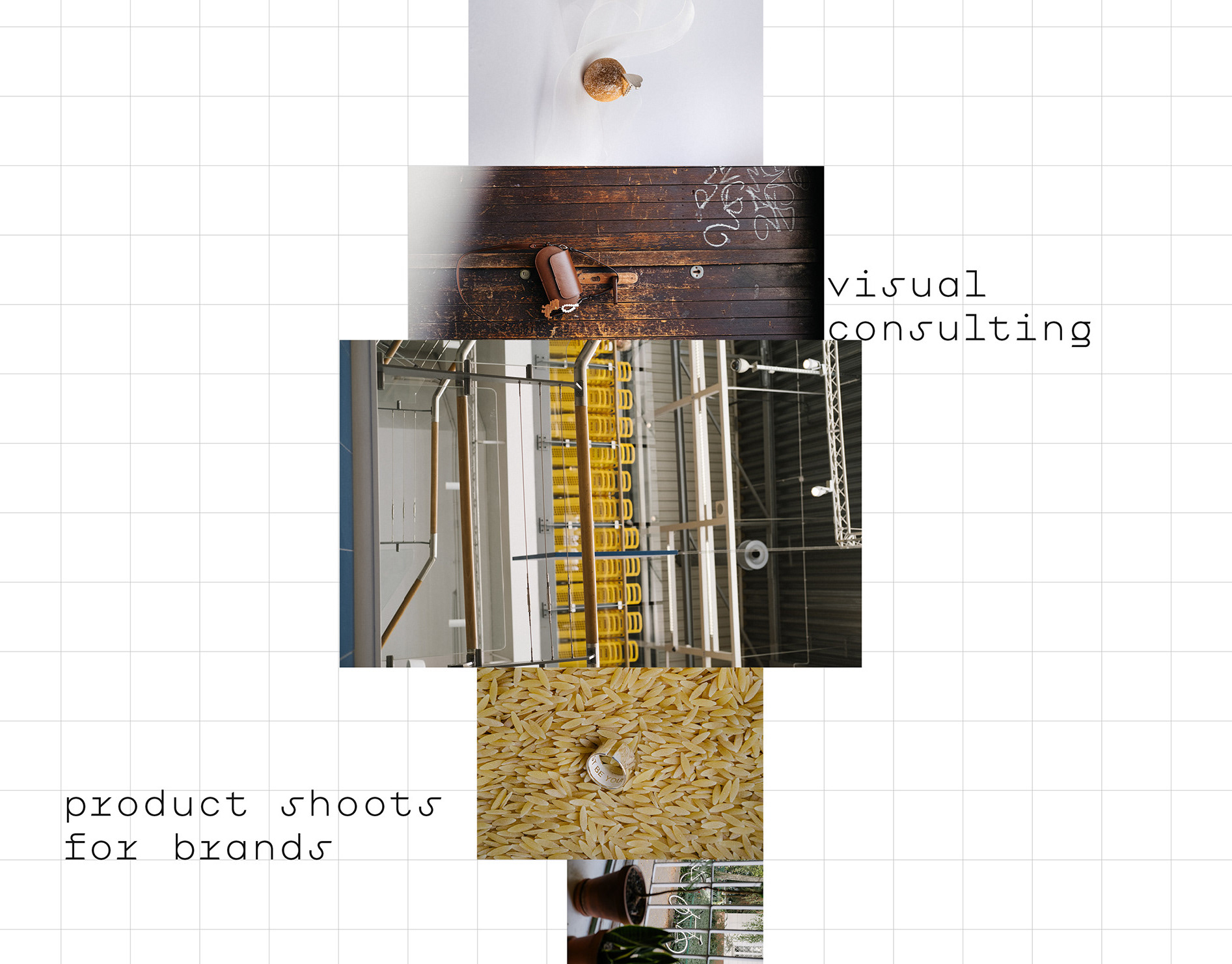
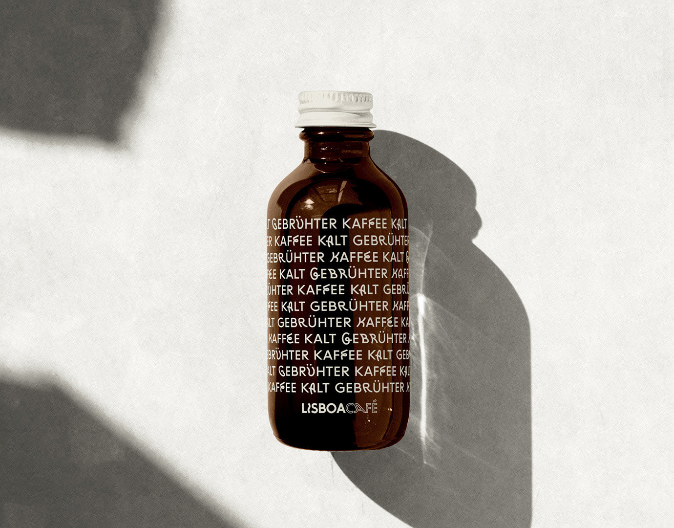
Client: ODS is a Berlin-based lettershop and digitisation service. Their work is the unglamorous infrastructure of business communication — printing, sorting, and dispatching client mailings, digitising physical archives. The kind of company whose success depends on staying invisible.
Assignment: Develop a visual identity for a B2B service company that handles communication on behalf of others. The system needed to communicate process clarity, while staying flexible enough to represent very different kinds of client work under one brand.
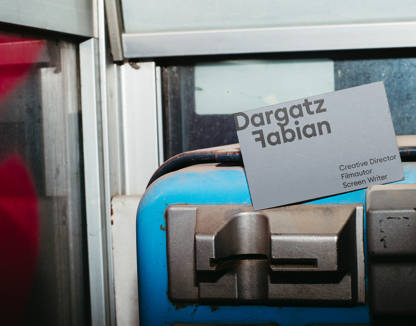
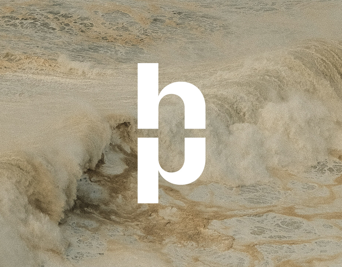
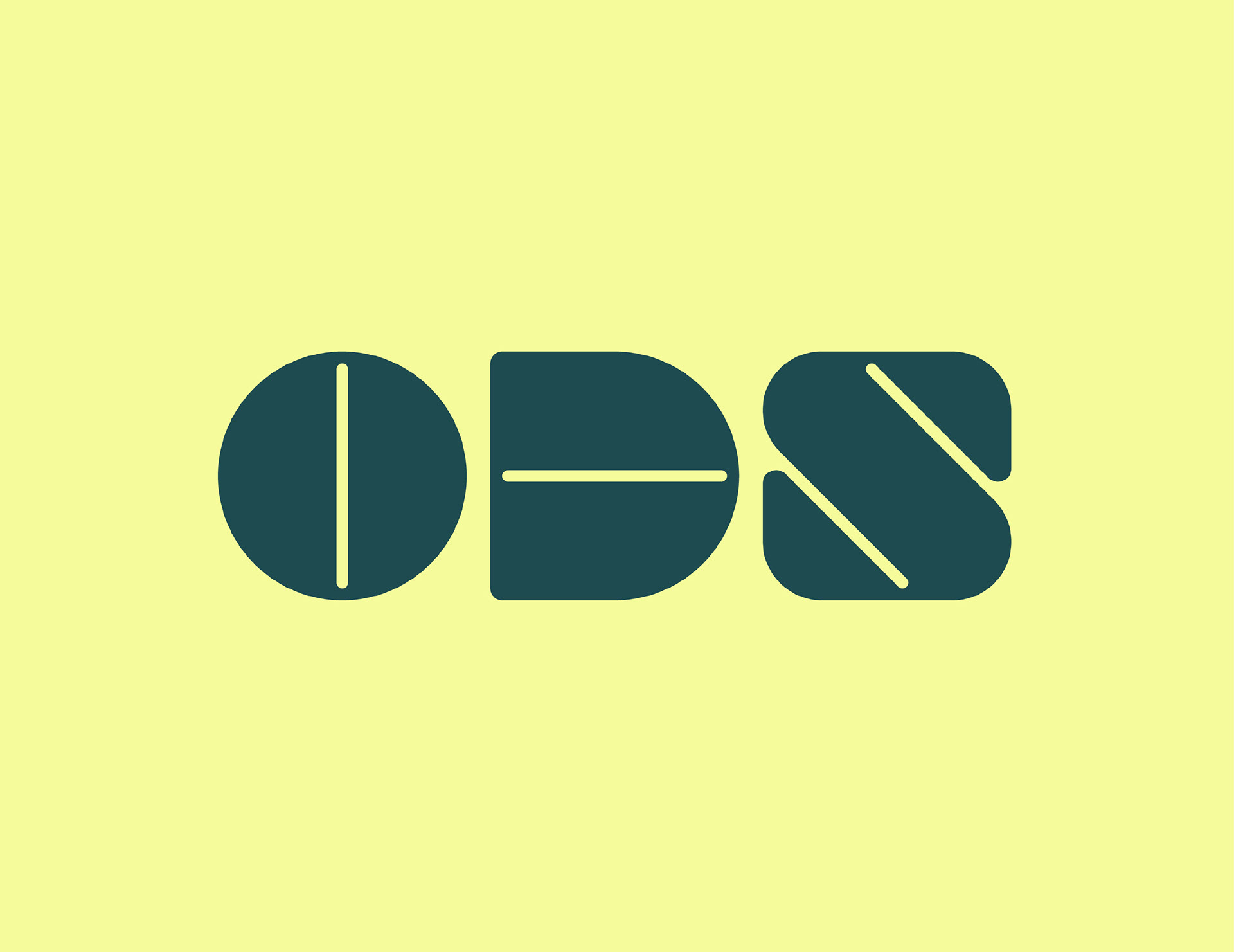
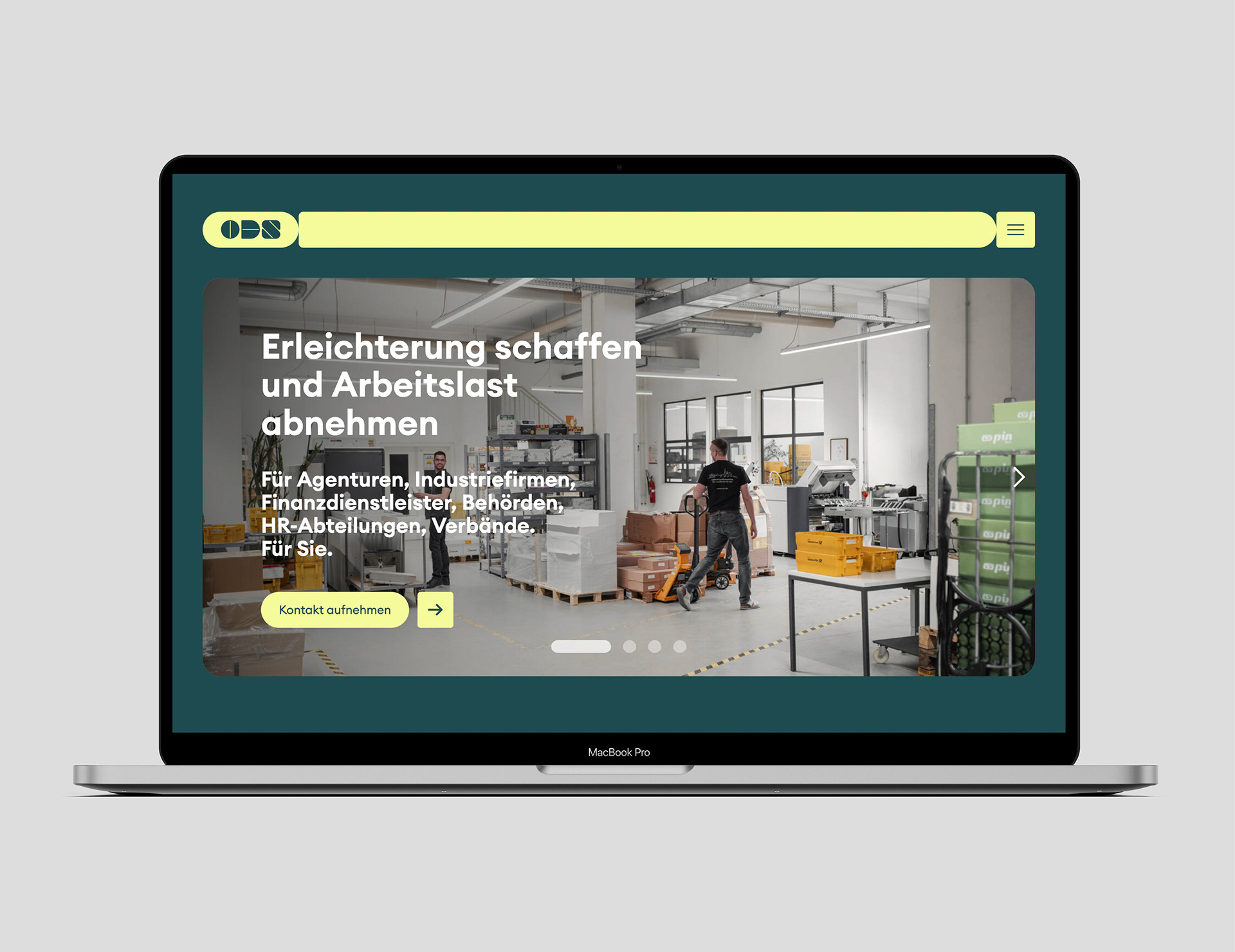
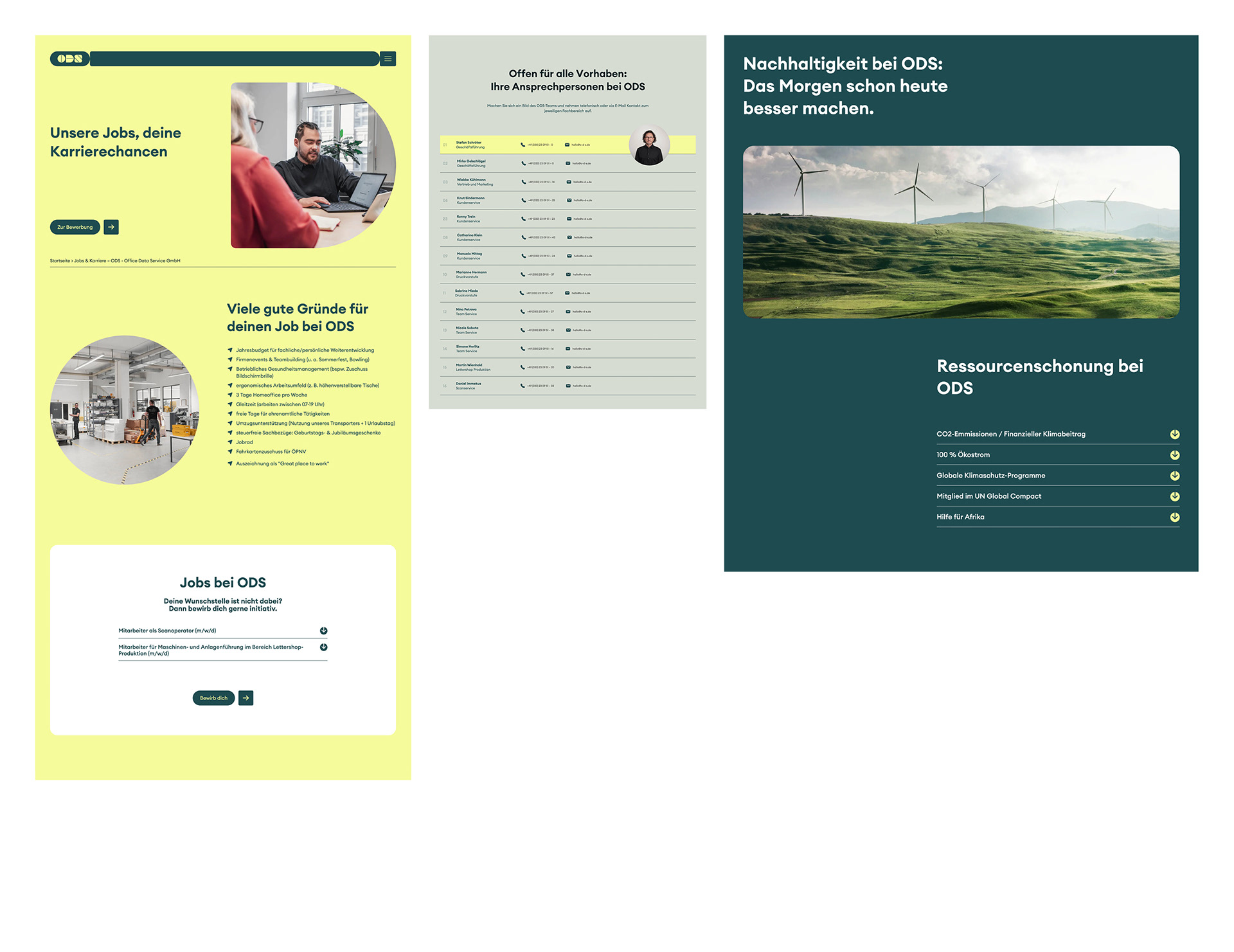
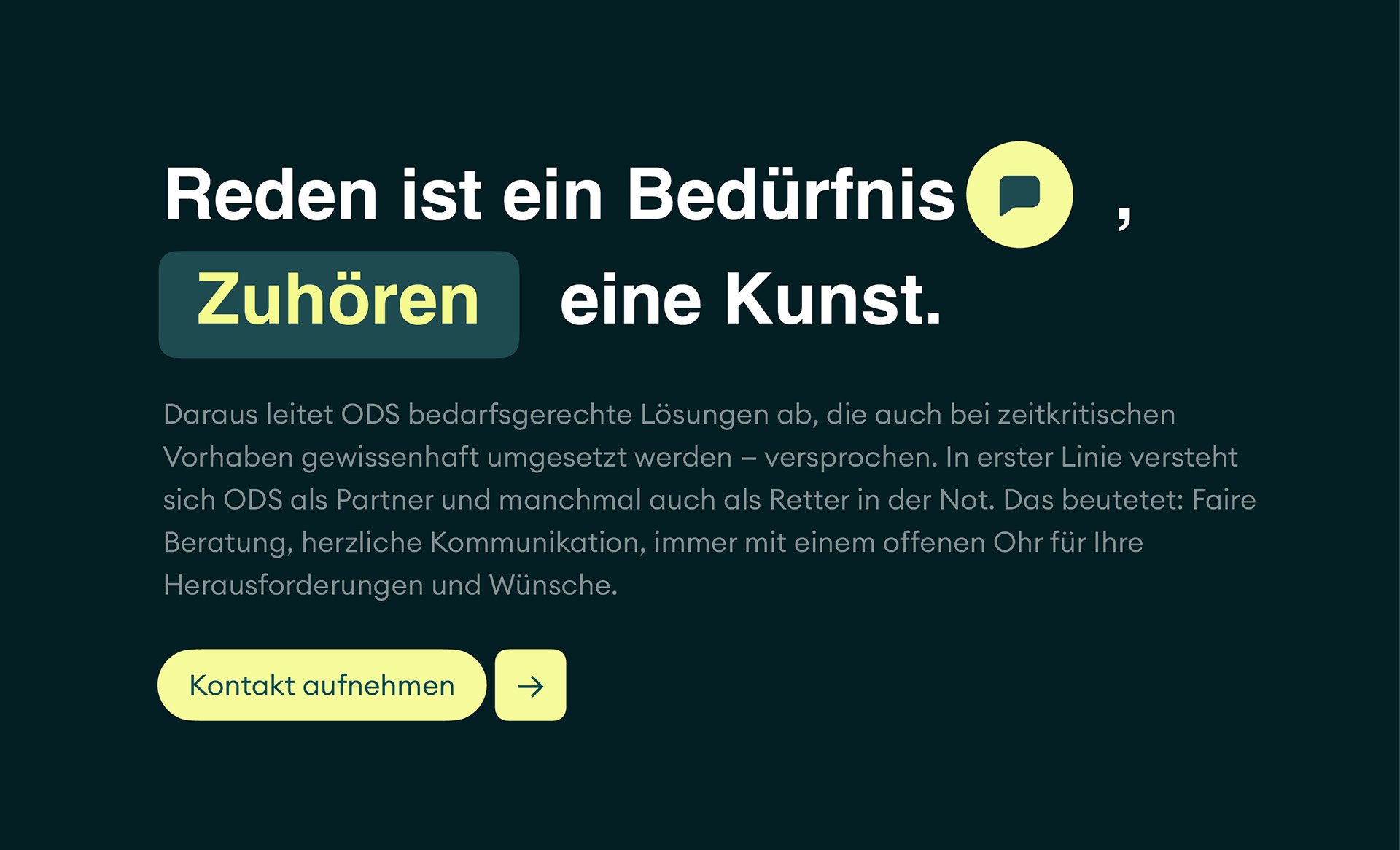
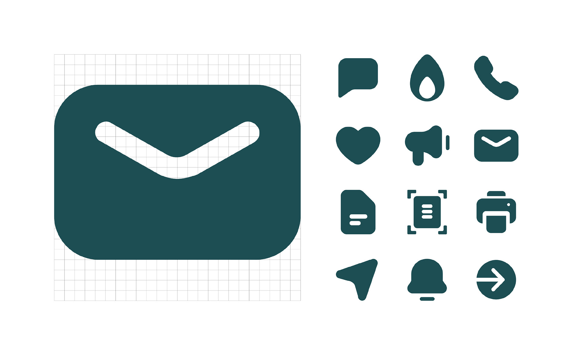
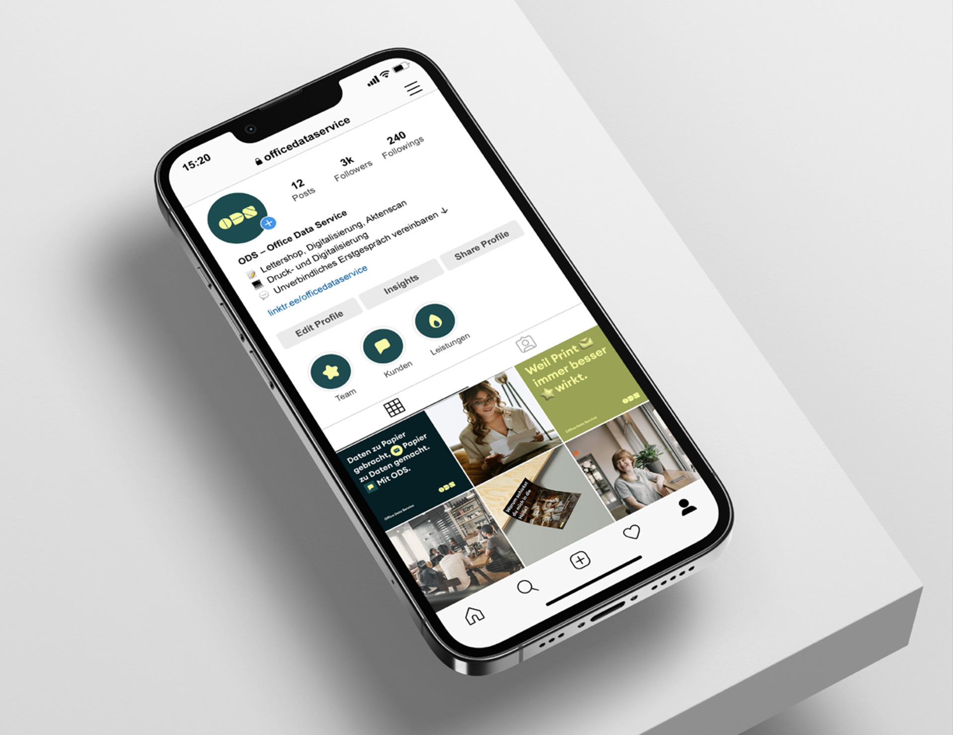
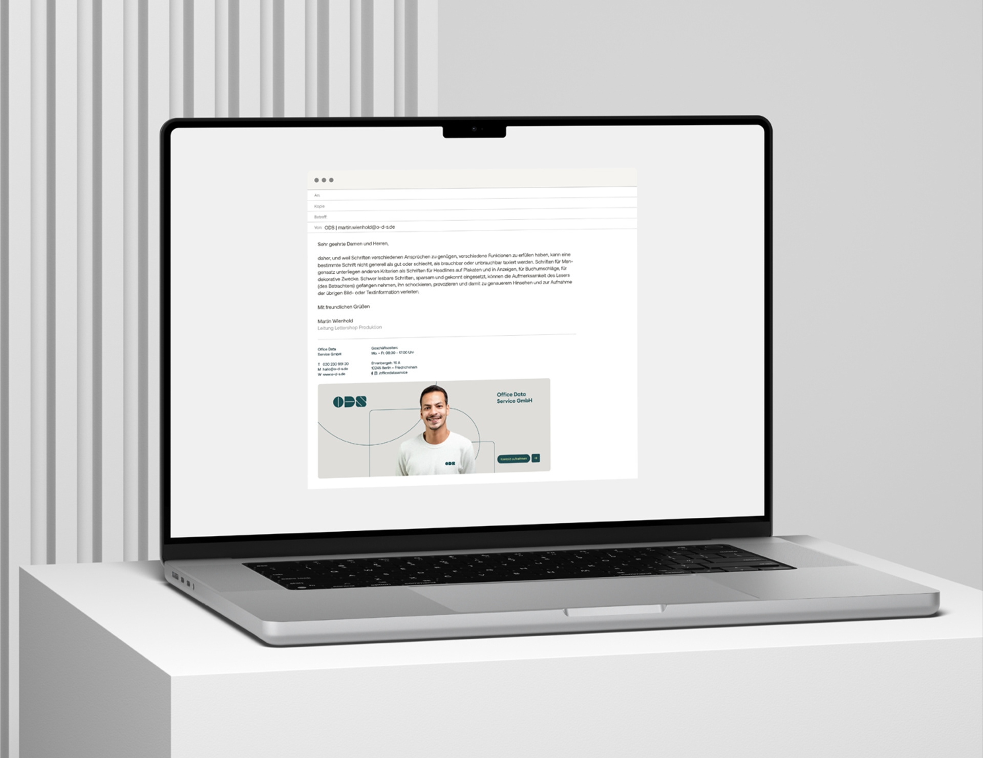
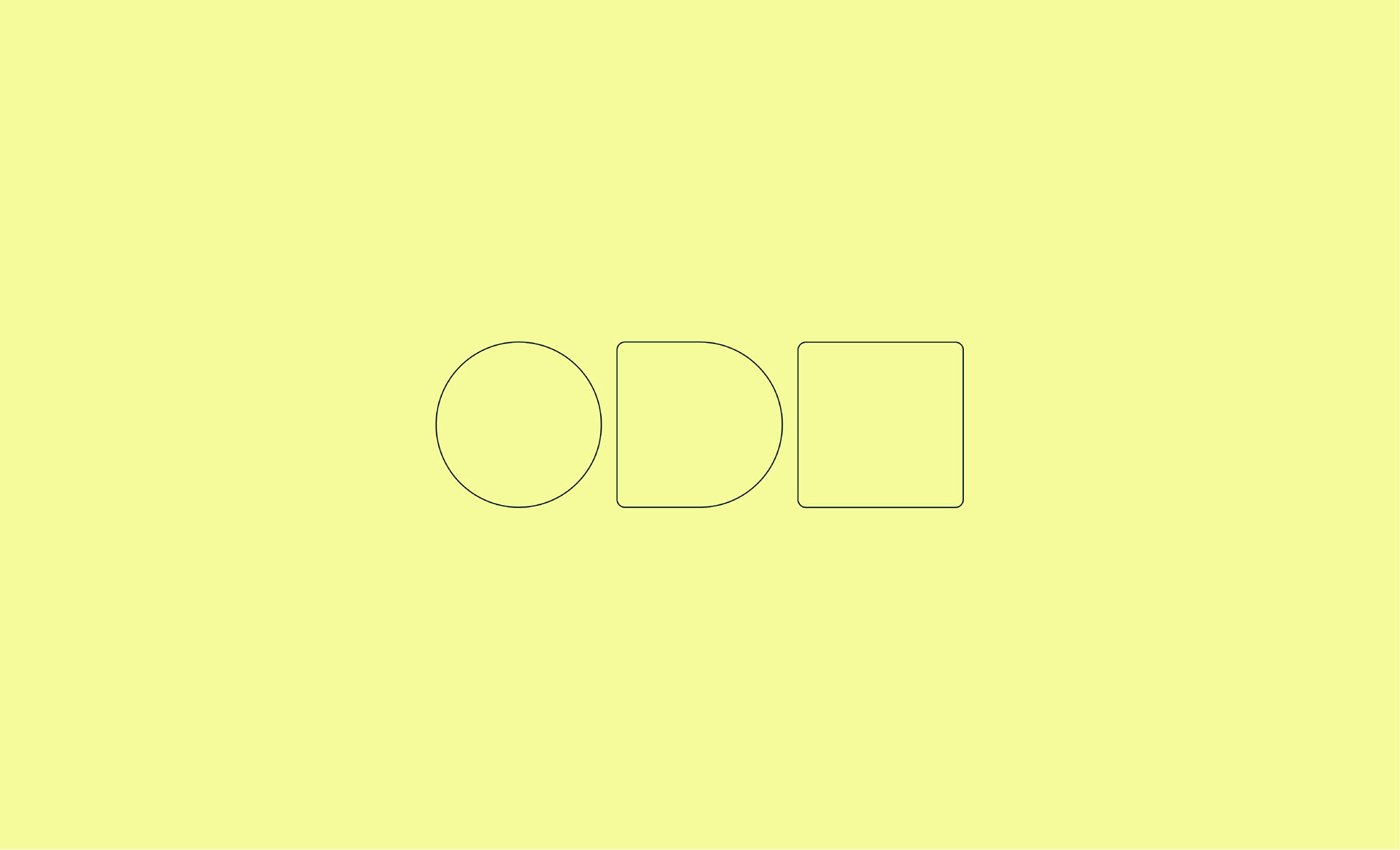
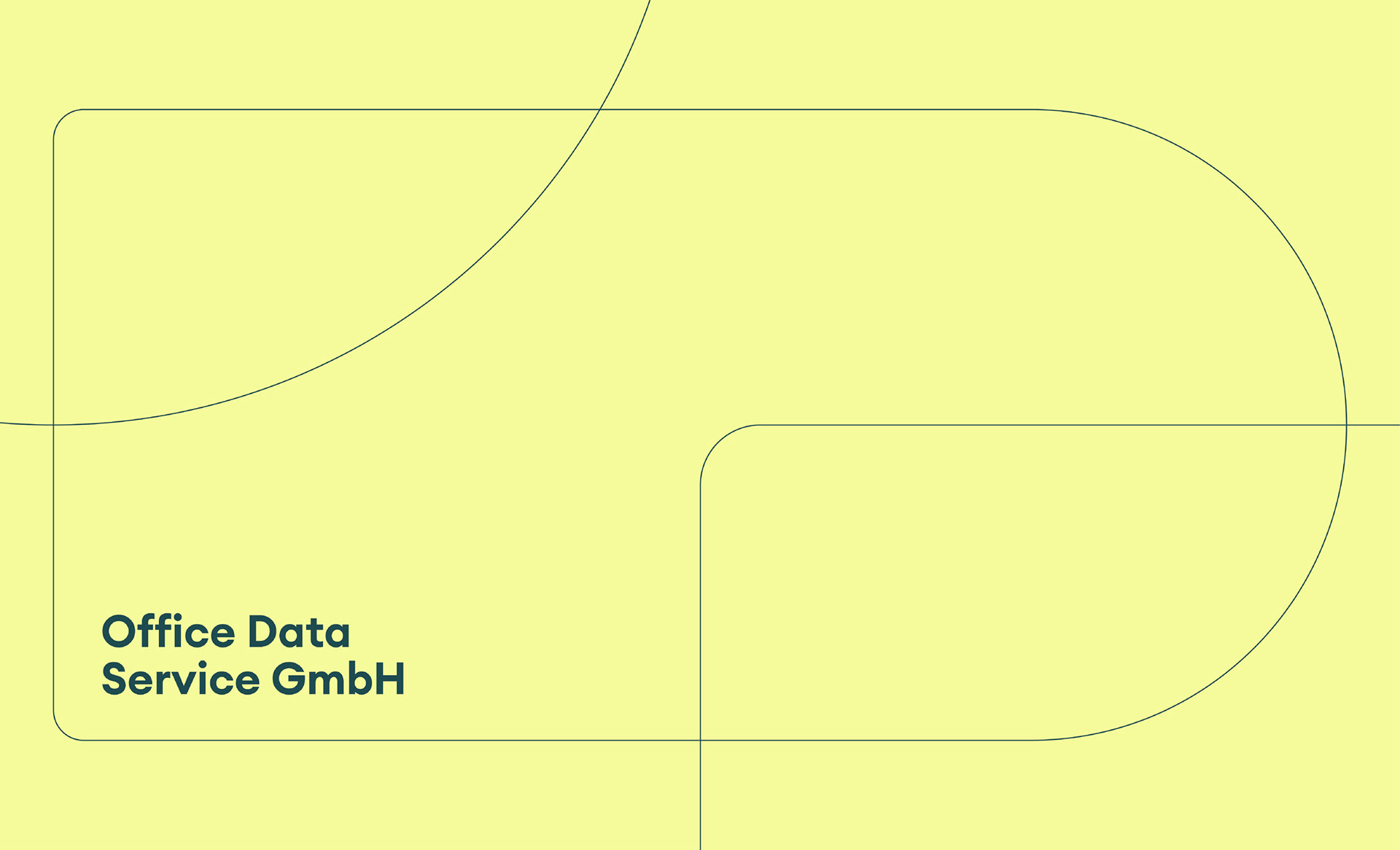
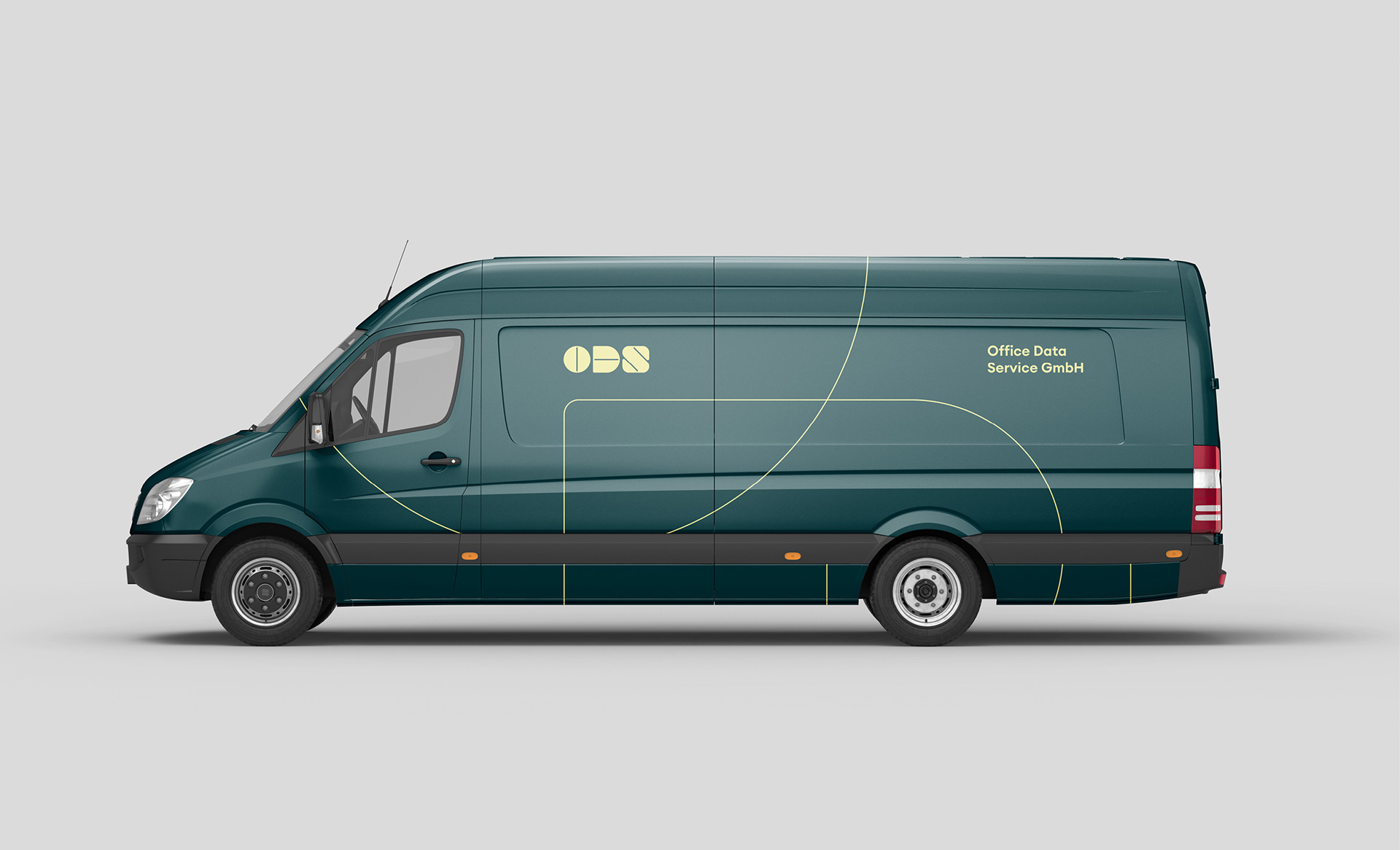
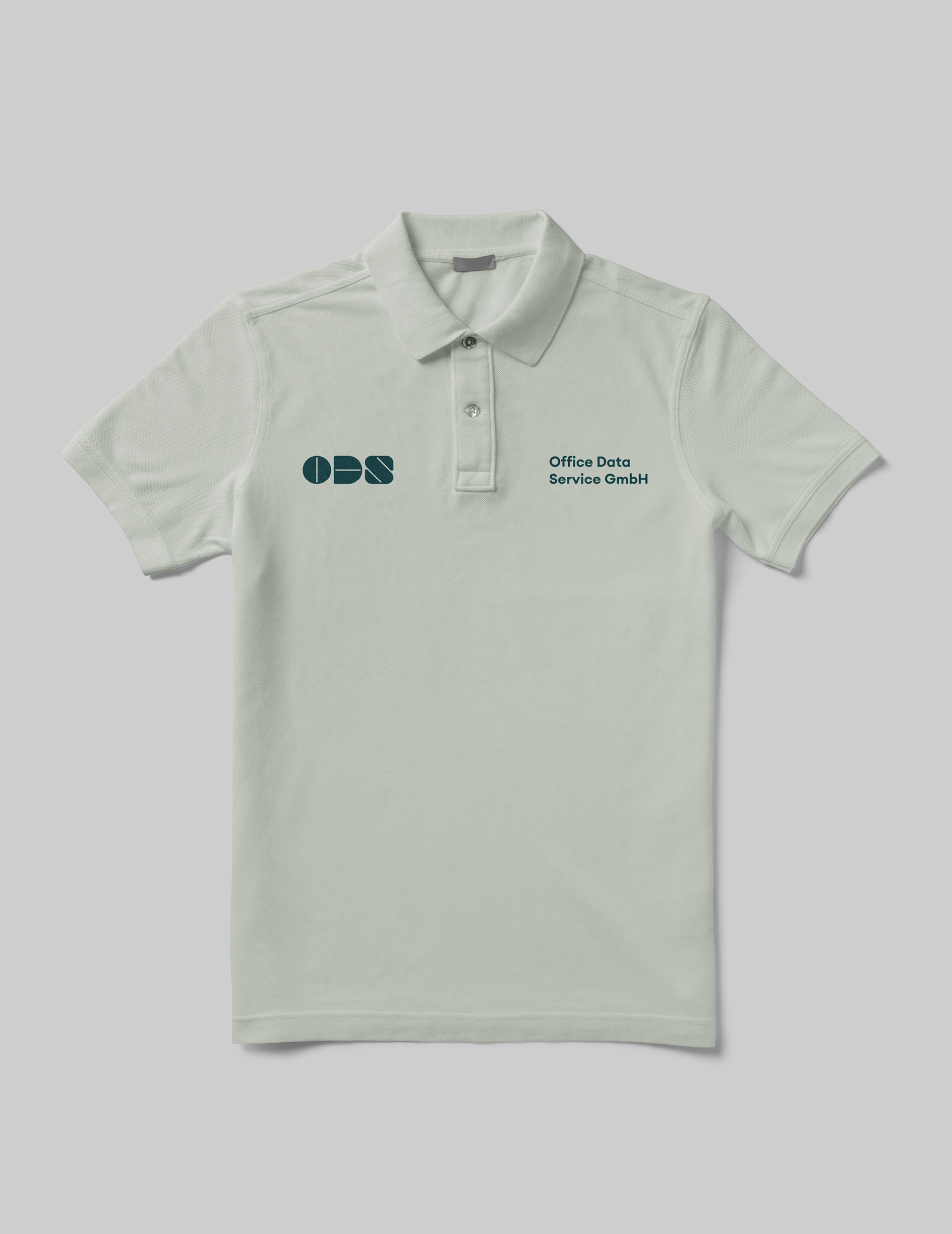
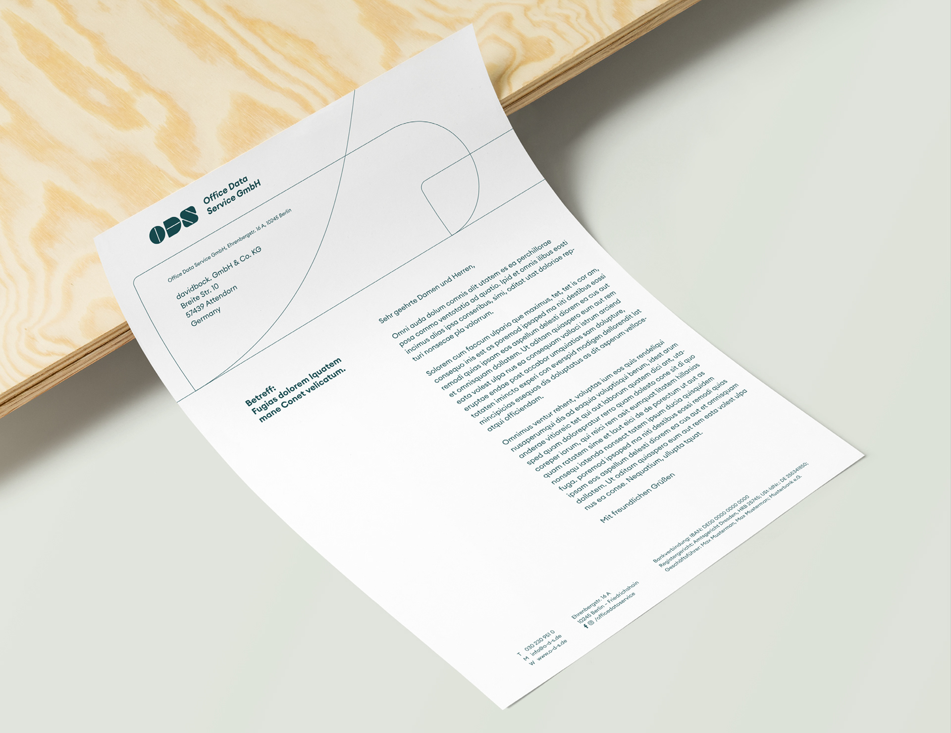
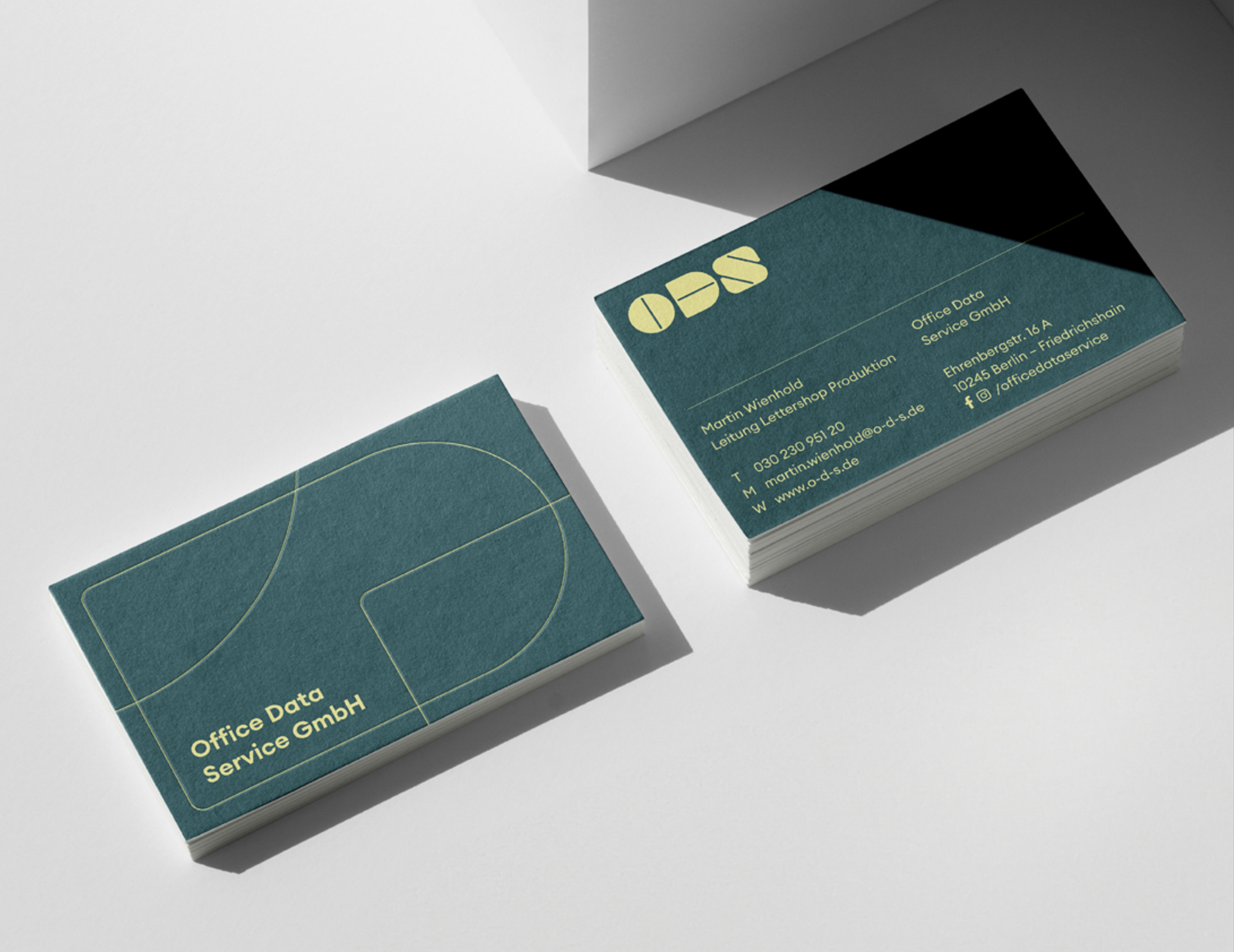
Solution & Process: The wordmark is modular — built from geometric shapes that detach from the logo and become a visual vocabulary of their own. Those shapes operate across the system, mapping process steps and giving individual client projects their own distinct identity within the brand. The colour palette is open and reconfigurable, used to differentiate work without breaking coherence. Euclid Circular A (Swiss Typefaces) keeps the typography neutral and lets the shape logic do the speaking.
Assignment: Develop a visual identity for a B2B service company that handles communication on behalf of others. The system needed to communicate process clarity, while staying flexible enough to represent very different kinds of client work under one brand.
Solution & Process: The wordmark is modular — built from geometric shapes that detach from the logo and become a visual vocabulary of their own. Those shapes operate across the system, mapping process steps and giving individual client projects their own distinct identity within the brand. The colour palette is open and reconfigurable, used to differentiate work without breaking coherence. Euclid Circular A (Swiss Typefaces) keeps the typography neutral and lets the shape logic do the speaking.
YEAR: 2024
ROLE: Visual identity, graphic design, web design
(co-designed with Simon Hopf)
CLIENT: ODS, Berlin
AGENCY: davidbock.agency
TYPEFACE: Euclid Circular A (Swiss Typefaces)
ROLE: Visual identity, graphic design, web design
(co-designed with Simon Hopf)
CLIENT: ODS, Berlin
AGENCY: davidbock.agency
TYPEFACE: Euclid Circular A (Swiss Typefaces)