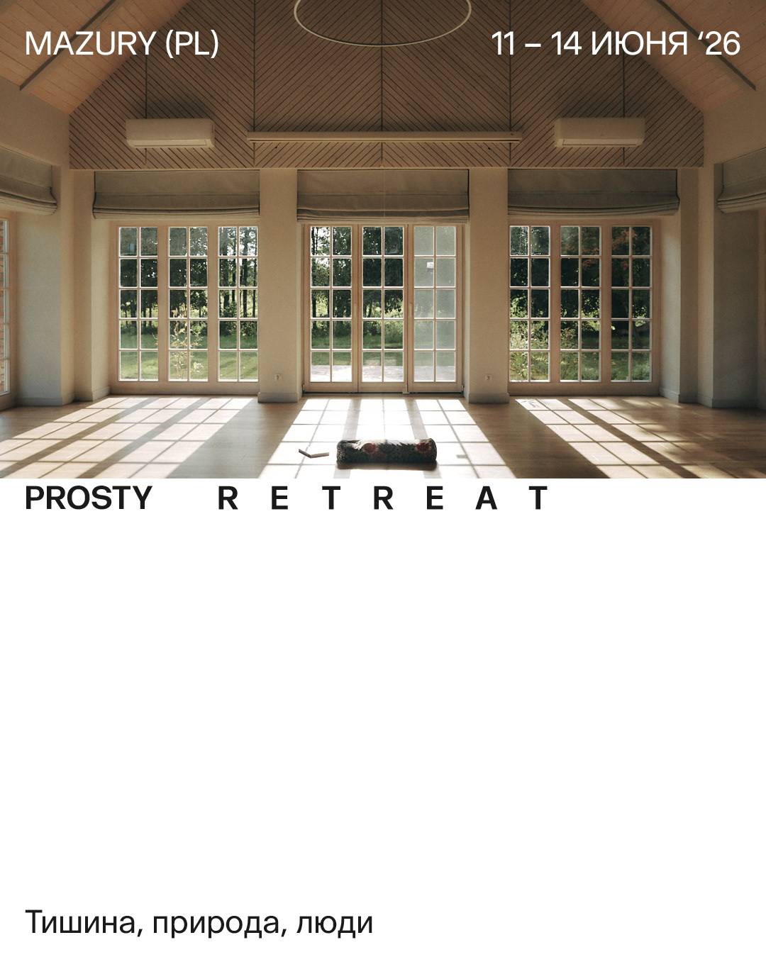
PROSTY RETREAT
Brand Identity, 2024
Brand Identity, 2024
Client: Prosty is a retreat practice running in Poland and Belarus — yoga, free movement, meditation, silence. The name means "simple" in Belarusian. Every retreat begins the same way: participants gather in a circle.
Assignment: Build an identity for a practice whose name already contains the brief. The system needed to work across sub-brands, merch, posters, and social media — and hold its logic from the mark outward.
Assignment: Build an identity for a practice whose name already contains the brief. The system needed to work across sub-brands, merch, posters, and social media — and hold its logic from the mark outward.
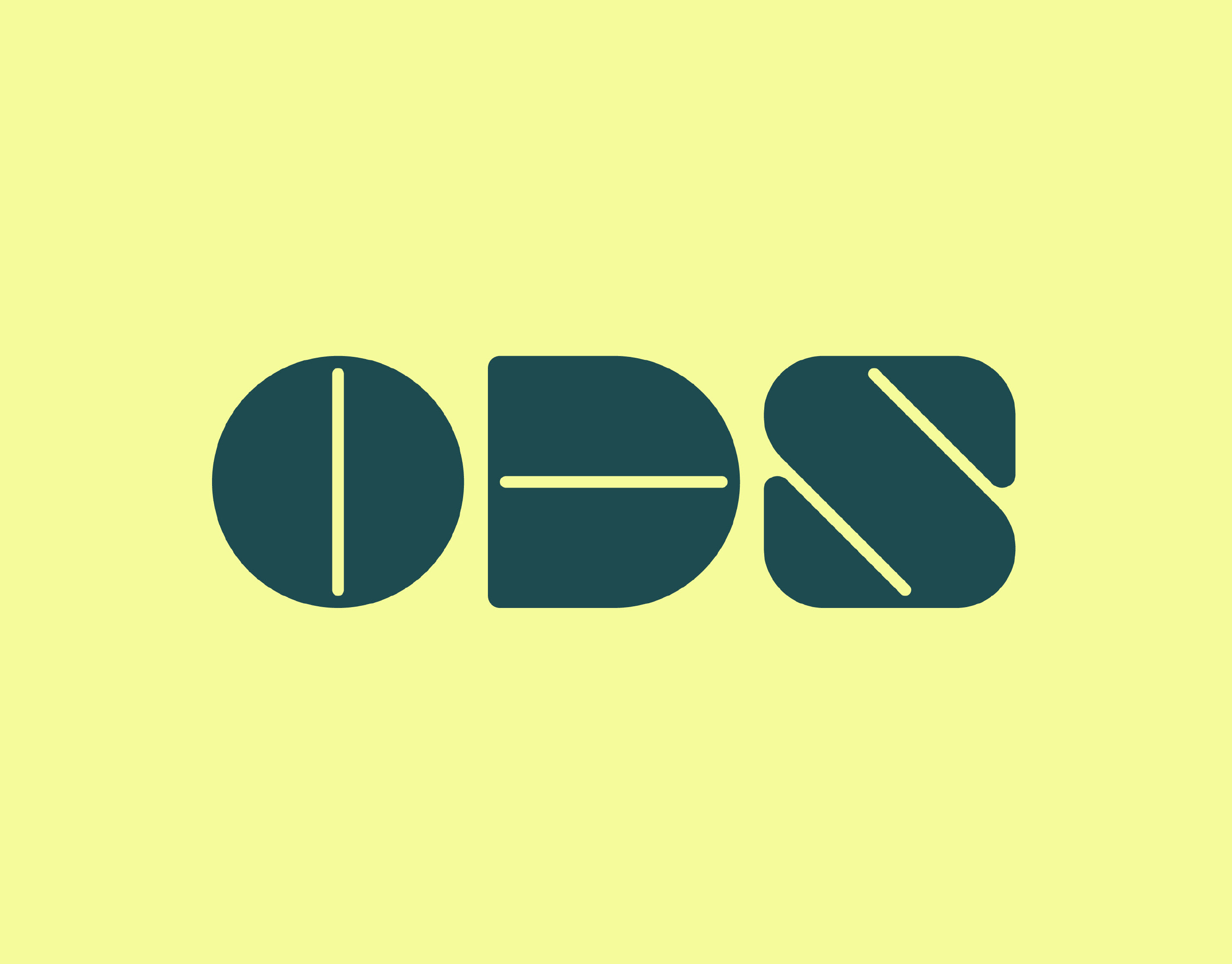
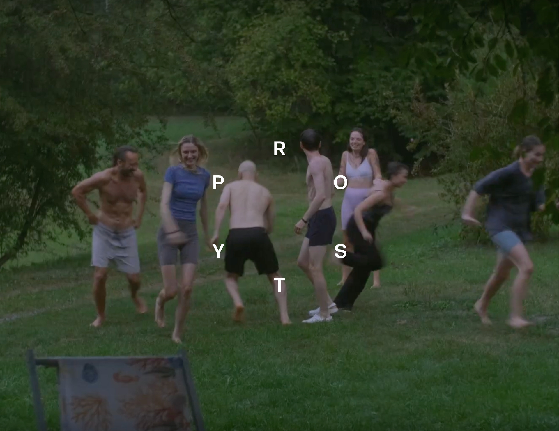
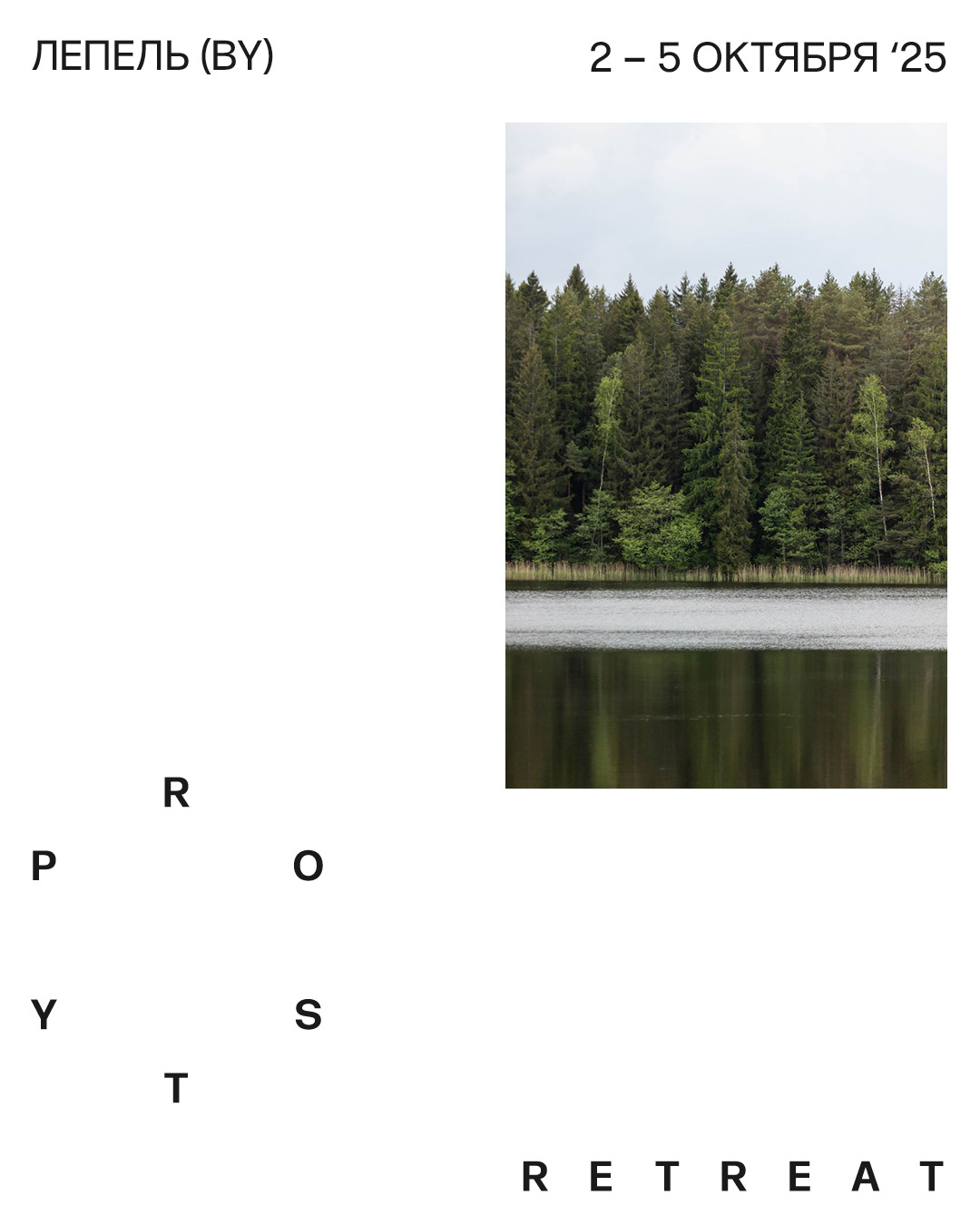
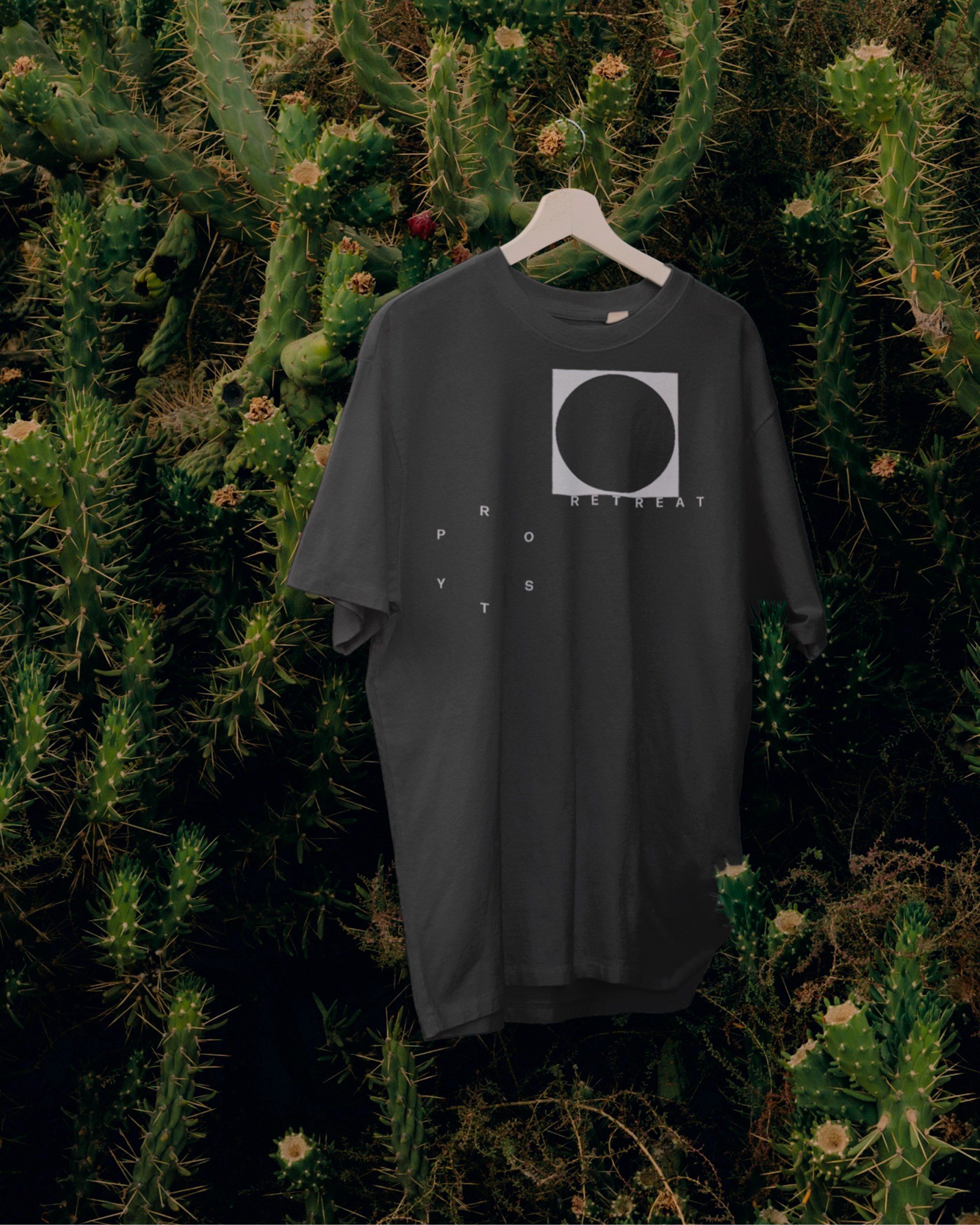
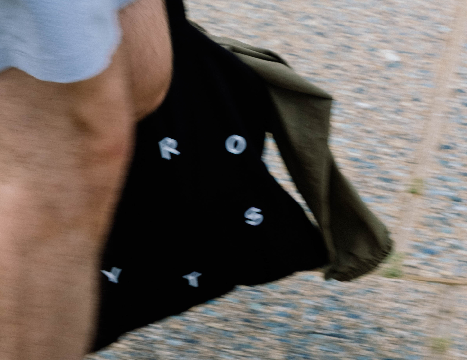
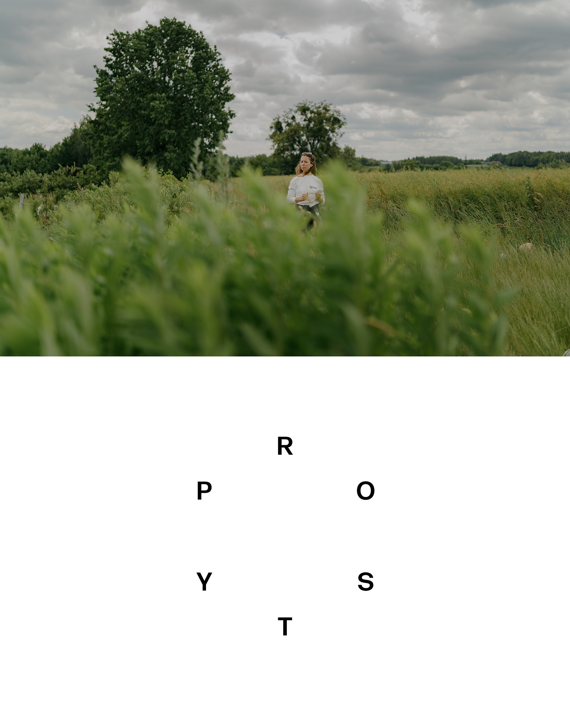
Solution & Process: The mark is the name arranged as a clock face. PROSTY — six letters, six positions around a circle. Three things encoded in one form: the word itself, the opening circle ritual that starts every retreat, and the idea of time slowing down.
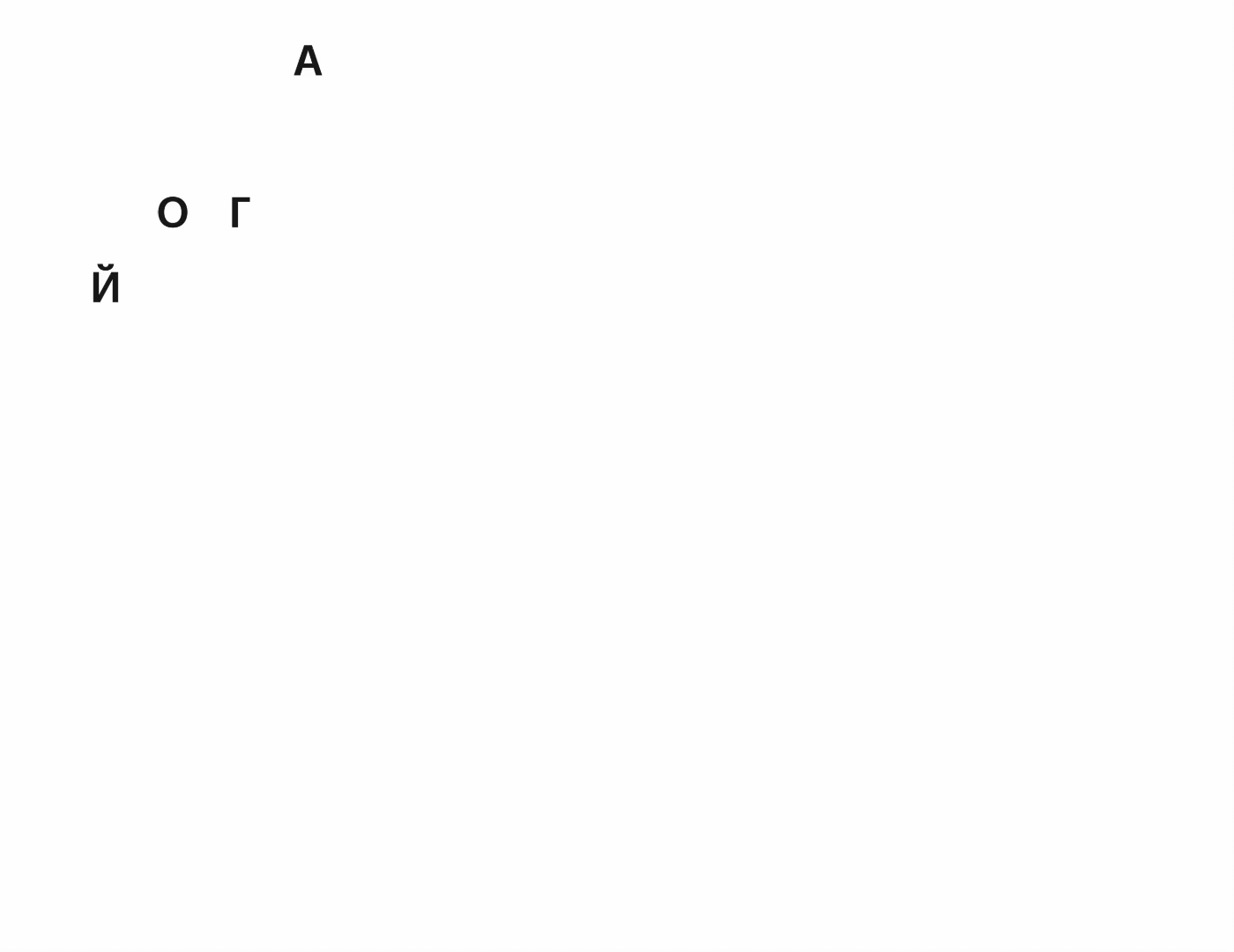
The animation makes the logic visible. Six dots appear one by one around the circle, then resolve into letters. People gathering. The mark forming.
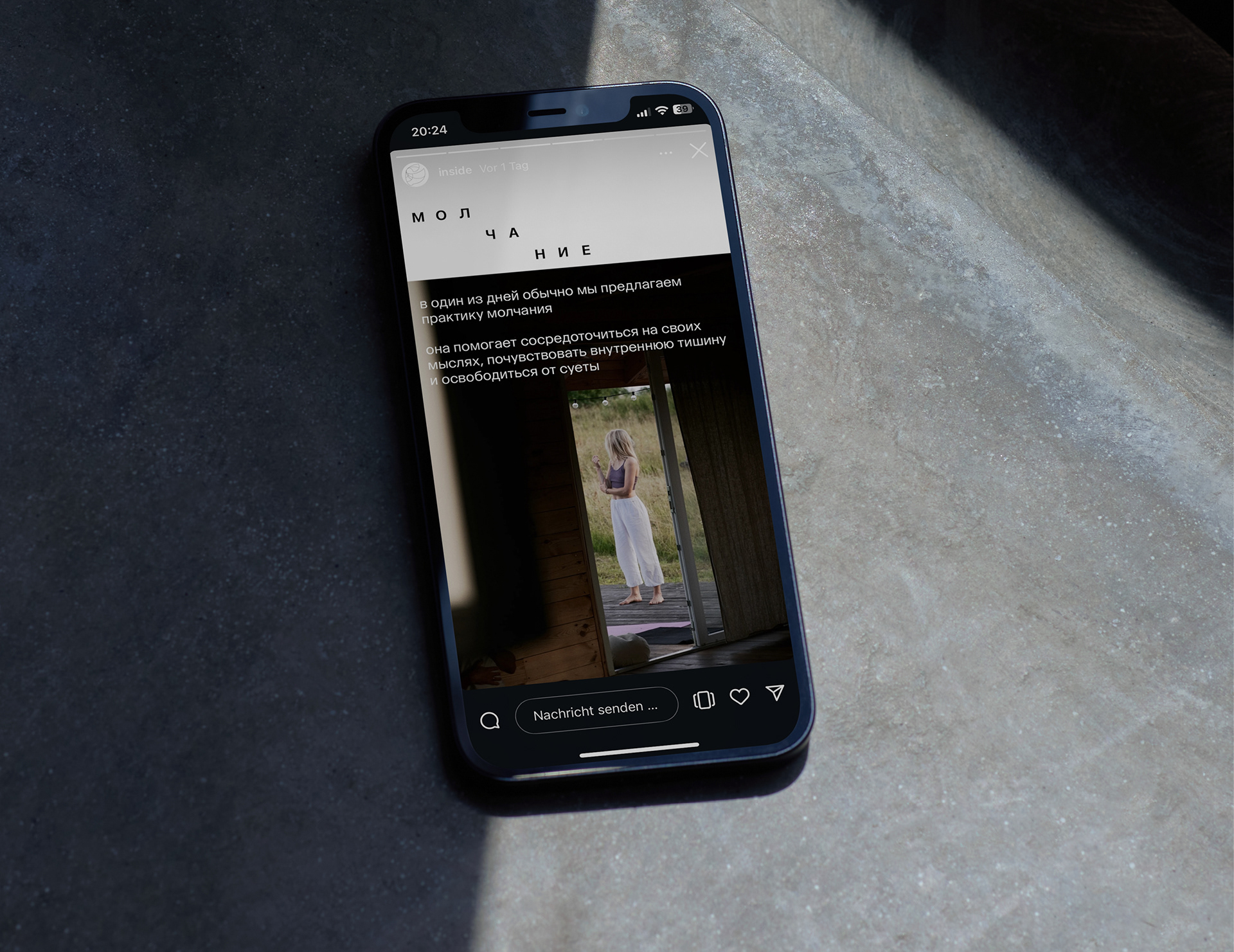
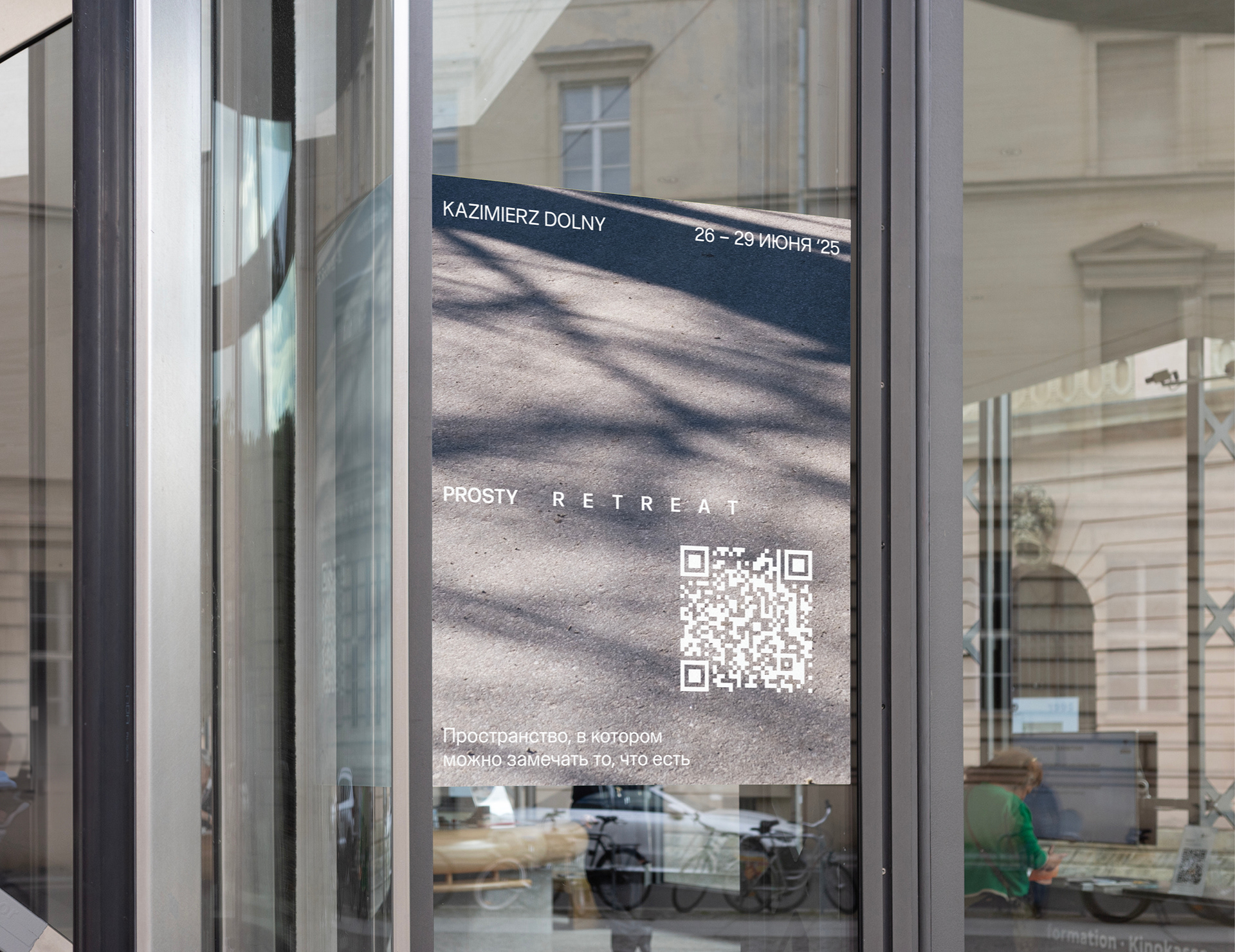
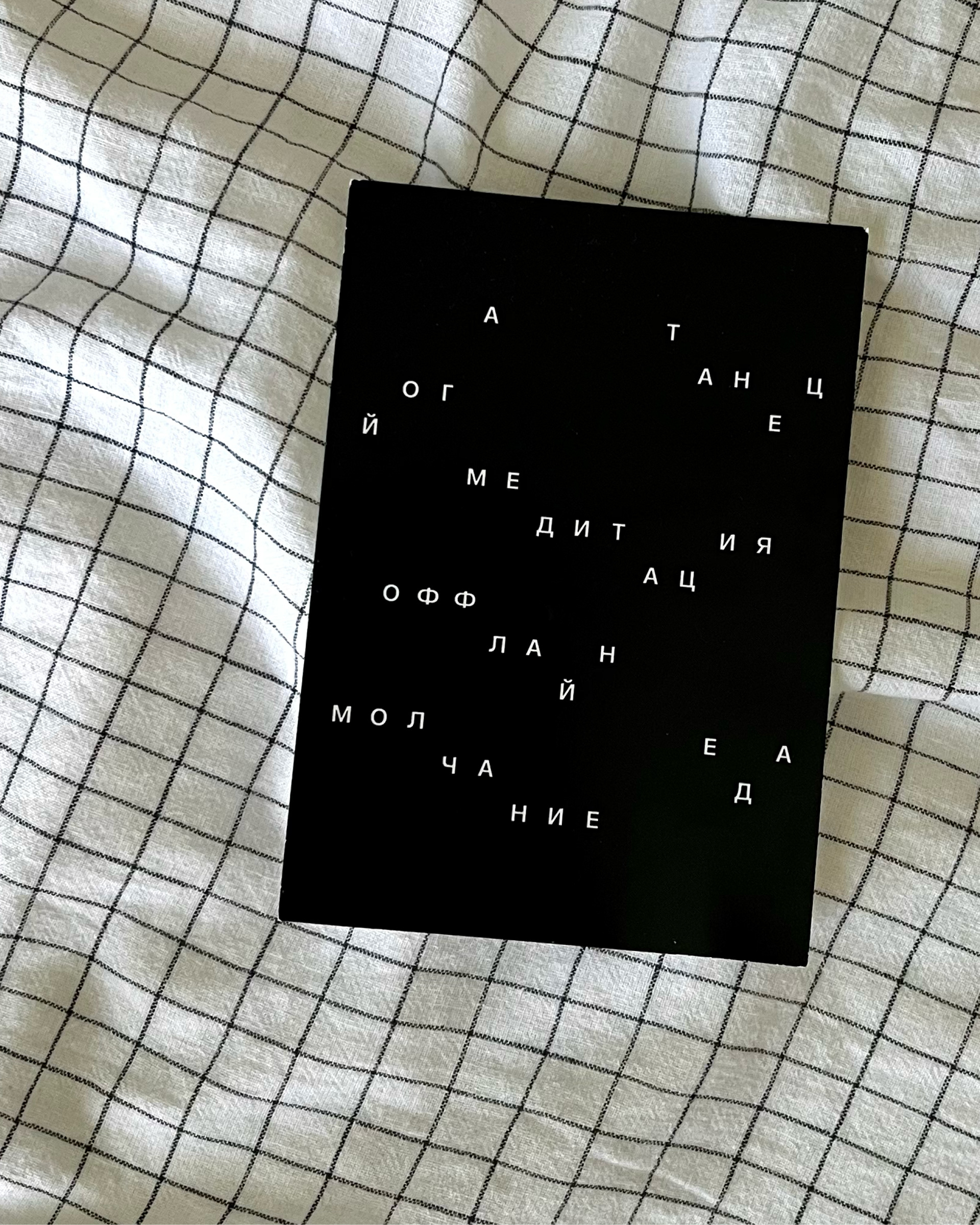
From this move the system builds outward. Each letter stands alone over a photograph — six posts, one cycle, one retreat. Sub-brands inherit the same logic. Typography scatters across social frames as the vocabulary of each practice: silence, dance, yoga — one word per frame, one breath per post.

YEAR: 2024
ROLE: Art direction, visual identity
CLIENT: Prosty Retreat — Poland / Belarus
PHOTOGRAPHY: Zhanna Smetana
TYPEFACE: KTF Prima, Kyiv Type Foundry
DELIVERABLES: Identity system, merch, stickers, posters, social media
ROLE: Art direction, visual identity
CLIENT: Prosty Retreat — Poland / Belarus
PHOTOGRAPHY: Zhanna Smetana
TYPEFACE: KTF Prima, Kyiv Type Foundry
DELIVERABLES: Identity system, merch, stickers, posters, social media